PROBLEM ANALYSIS
Good development of original concept to something more personal to the course. Good direction from a constraining idea.
Good/Very good
CONTEXTUAL UNDERSTANDING
Good method of delivery. Think possibly of how to package the poster & booklet together. Think about the consistency of the pages, refine the style.
Very good
RESEARCH
More research from other people's opinions.
Good
Showing posts with label Speaking from experience. Show all posts
Monday, 23 May 2011
Friday, 20 May 2011
Thursday, 19 May 2011
poster development and variation.
Because of the stock I was using I wanted to create something that almost highlighted this. For this poster I wanted to go for the same stock as I had used for the front cover of the book because as well as a bit of visual consistentecy, it gave a really nice finish. Using this heavy border I thought might do this, also keeping consistent with the colour of the type.
here I moved away from the border and looked at a simple design making use of the colour of the stock showing through only for the type. A slight variation in the position of the accompanying text.
Again... combining all the elements at the bottom of the poster.
Here I tried a different approach, using the border again but making it heaver on the sides, and placing it towards the top of the poster. I also chose to create a a rectangle in the middle with almost the appearance of the red type being reversed out of the stock
This time looking at black lettering as opposed the red type. However I much prefer the previous poster variation.
Looking at different composition of text, giving it a different weighting, with much more stock colour being visible.
Again altering the size of the text, this one to a much larger size than previously.
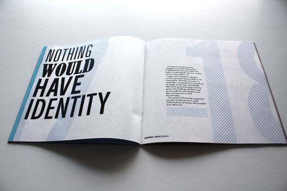
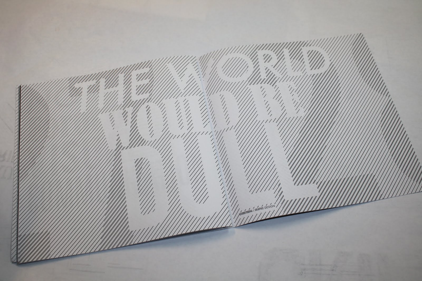
a Look at the background that I was trying for the second variation of my poster. trying a technique I had used previously in the book itself.
These screens show the process I used in Illustrator for creating the letters using only diagonal lines. Creating a series of lines to the right widths using the blend tool and then using the pathfinder to cut the shapes of the letters from the lined background.
Here is how it appeared before I placed it into the indesign document.
Wednesday, 18 May 2011
Subscribe to:
Posts (Atom)