Typografie board

Showing posts with label Typografia 2. Show all posts
Showing posts with label Typografia 2. Show all posts
Tuesday, 11 December 2012

Friday, 7 December 2012
typografia 2 - printed posters


Thursday, 6 December 2012
Typografia 2 - Final Tickets


The finished designs for tickets for the event, this includes both general admission and and admission for the talks. Same as the other printed matter, the colours correspond to the gallery in which the exhibition is being held, red for the Stedelijk in Amsterdam and off white for the Museum Fur Gestaltung in Zurich
Typografia 2 - Perforated tickets


Wednesday, 5 December 2012
Typografia 2 - Event Programme
Final spreads for the typografie event programme. This is how the book will appear when printed, however with it being a french fold the printing spreads will be rather different from these ones. It will be printed digitally, full colour, on off white sugar paper, as a lot of the promotions I have done up to this point have used sugar paper.
Typografia 2 - Final Talk Posters


Here are the final talk posters for the Typografie event for both the Stedelijk and Museum Fur Gestaltung. Similarly to the other promotions they are separated by stock, however for the experimental Jetset poster I have also included a second printed colour, as they are well known for using two bold colours in their works to pick out different information. In this case I used it to make the words more readable, as without these colours, it all blends into one word and can be quite difficult to make out, especially as some of the words won't be instantly recognisable.
Similarly to the previous event posters I tried to pick out elements within either the name or the designers work that could be portrayed through the poster just as an initial starting point for visuals. However I often find that these are the best examples and I choose these over more developed examples. These should be A1, especially the A2/SW/HK poster as the format is integral to the concept behind the poster.
Typografia 2 - Final event posters


These are the finished event posters as they will look when printed. the background colour will be the colour of the stock so when printing will only require one colour. They will however be double sided so that they can be displayed together as they are here, or on a window for example and have something to read on both sides.
Sunday, 2 December 2012
Typografie - Tickets
A number of ideas for tickets for Typografie event. Think the examples using simple type work best as they can be applied in single colour to a ticket utilising stock and still get an interesting finish. Due to the small area it is fairly difficult to squeeze a lot of information in so I think it's better that they convey only through type in true modernist style.
Friday, 30 November 2012
Typografia 2 - Flyer print tests


Initial tests printing the flyers on the laser printers in the studio. Think If I were to do these justice I'd have to have them printed downstairs on the inkjet printers, to get the black much flatter. here it is very rough, but I think it gives a good idea of how the design looks to scale. Even with some of the text at around 7pt it still remains easily readable so I think this is working fine.
Typografia 2 - Talk Transcripts


For the purpose of the exhibition, I thought it would be nice for those attending talks to receive a little transcript of the talk they've just attended as it will allow them to go over anything they missed but also have something to take away to say that they'd been there. I produced these quick examples of how they may look.
They're A6, so quite small and colour is added using stock so that the information can all be printed in black to save the cost for the number that would probably need to be produced. Because of the small size I would also propose that they were produced in different languages instead of using the two column layout like in the event programme.


This bind is also the reason for the offset columns, as quite a lot of the page is lost with this bind.
Wednesday, 28 November 2012
Typografia 2 - programme mock ups.


Printed


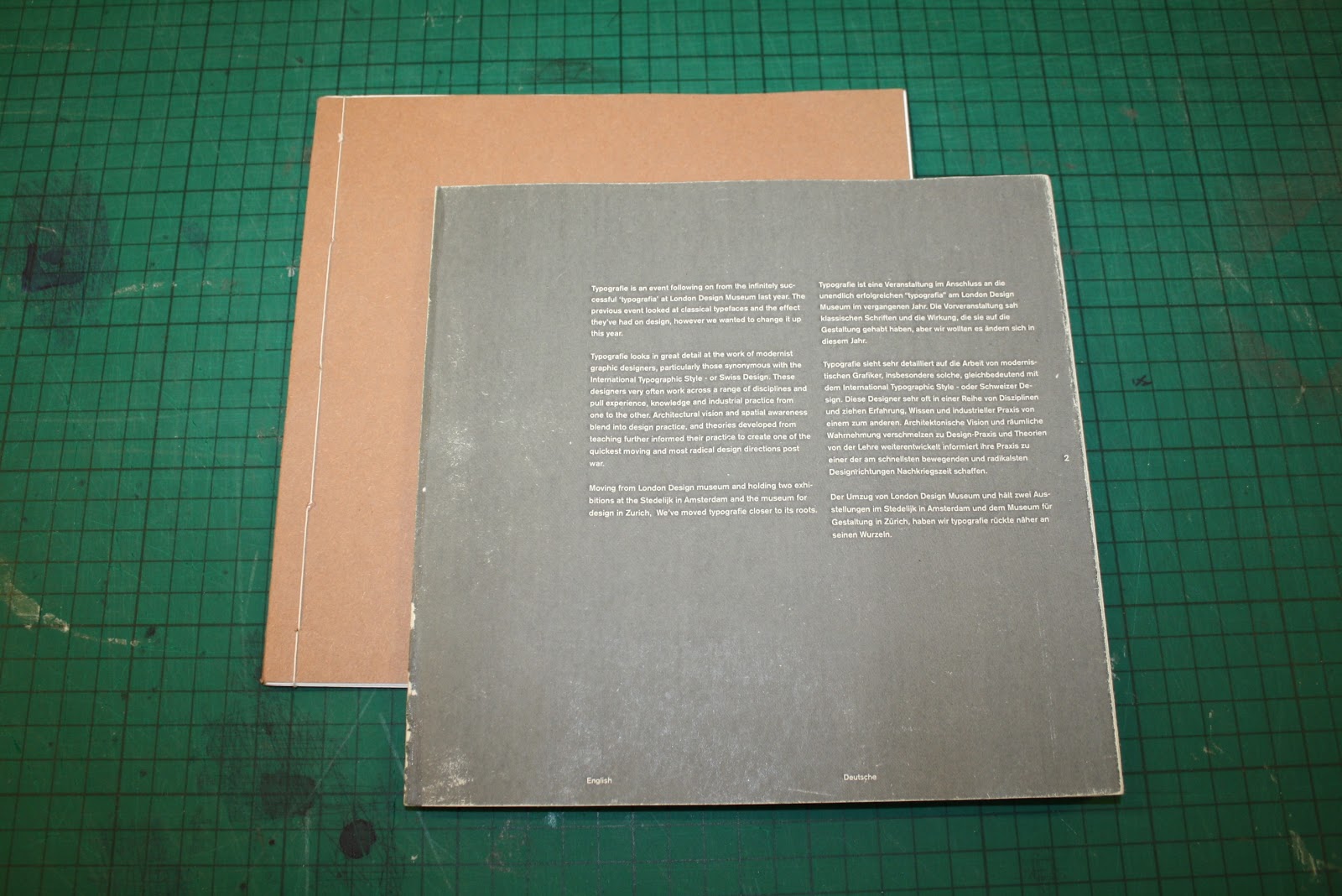
Not very clear from these images but this is also a french fold book, the inside of each of the pages will be printed with flood red to mirror the red of the identity and of the links with Swiss design. Any pages that are block grey, like the one above will also be flat red on the colour printed programme.
Wednesday, 21 November 2012
Typografia 2 - logotype - Re kerning.


Above I have added guides so it is more obvious where changes have been made, and although these are only very subtle, they definitely improve the finished logotype.
Changes made :
Bar of 't' joined to 'y'
'ogo' moved closer together.
gap reduced between 'r' and 'g'
gap increased between 'f' and 'i' (ligature makes out of balance)
gap between 'i' and 'e' reduced.
Tuesday, 20 November 2012


Subscribe to:
Posts (Atom)