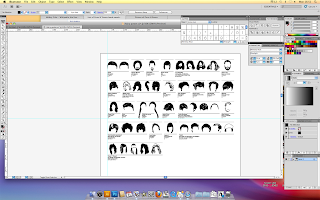
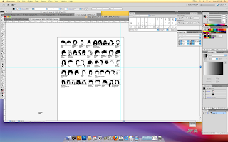
I then began placing my digitally reproduced hairstyles into an A1 document to create a large info graphic to go with the sticker book that would outline each sticker, who the hairstyle belongs to and also how they will be categorised in the book...
I chose to stick to a plain white background with a very simple typographic layout to give the clearest possible graphic. Which I think has worked really nicely.
Whilst drawing each hairstyle, I gave them a number as I was counting them off, however I thought there would be no need in creating a whole new system for categorising my collection when I had already gone through and almost subconsciously categorised them numerically.


No comments:
Post a Comment