Pictures of mock ups on yellow stock printed black and white, or in this case black and yellow... These were just to get an idea of how the nets were going to fit together and how the logo would appear reversed out from the flood colour on the yellow stock . I like the simplicity of these designs.
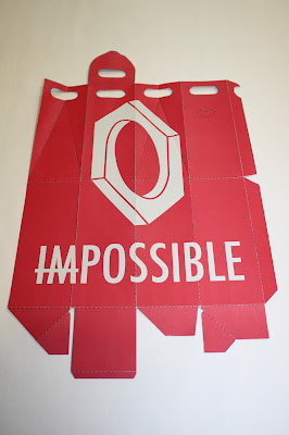
Photographs of the box net packaging making use of a different stock in a pale grey with the same bright red printed over. I really like how this gives such a different effect, changing even how vivid the colour red is, and the contrast between the two.


No comments:
Post a Comment