List 5 things a first year needs to know
1. No excuse is good enough
2. Don't even consider being late (even by a nanosecond)
3. The quickest route to college
4. How to cook/eat
5. It will all be worth it (hopefully)
List 5 problems a first year will encounter
1. lack of sleep - but do NOT show it
2. Hang overs.
3. Feeling of being worse than everyone else
4. being lost - both mentally and geographically.
5. lack of social life outside of GD
list 5 rules a first year needs to know
1. Don't be late
2. Meet deadlines
3. Keep your phone on silent in lectures and seminars especially
4. Blog.
5. Keep the studio spik and span

Monday, 25 April 2011
Thursday, 21 April 2011


Contour header


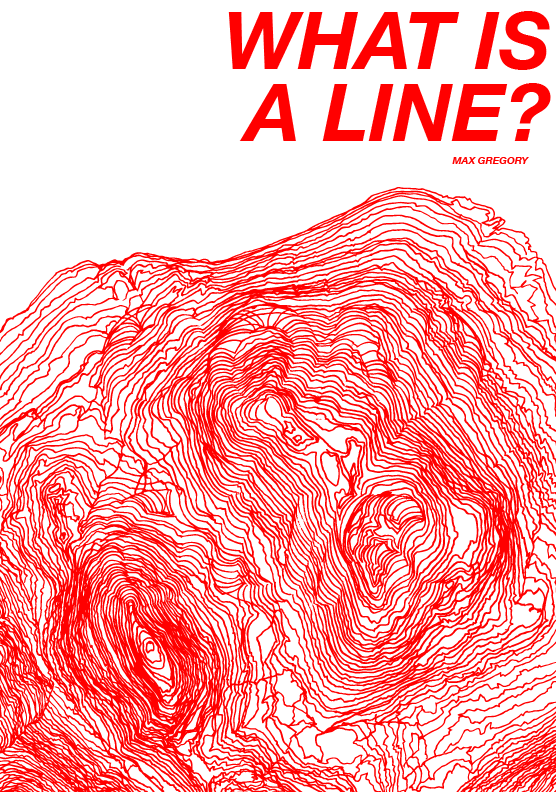
These are simply variations with the header on the image. I am feeling the red headers most as I think that a very bold colour is needed to give the image something more.
Digital development.

The original image scanned from my hand rendered drawing on trace. This had been altered in photoshop to increase contrast and bring out the colours using levels and curves.


Here is the image in illustrator and using live trace I was able to get a very detailed digital rendition of the contour lines without having the shading and loss of detail from the scan. With it being a vector it is also good for resizing however with the original A3 this shouldn't be a problem.


By expanding the live trace to create strokes I was then able to change the colour... Here is an example in red as this stood out well.


Wednesday, 20 April 2011
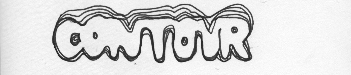
Contour typeface.


Using a small area in the map (noted under the name) I created this rather strange typeface. I quite like it, although some of the letters probably need work, and I'm not sure how well this writes.
Contour Photos...


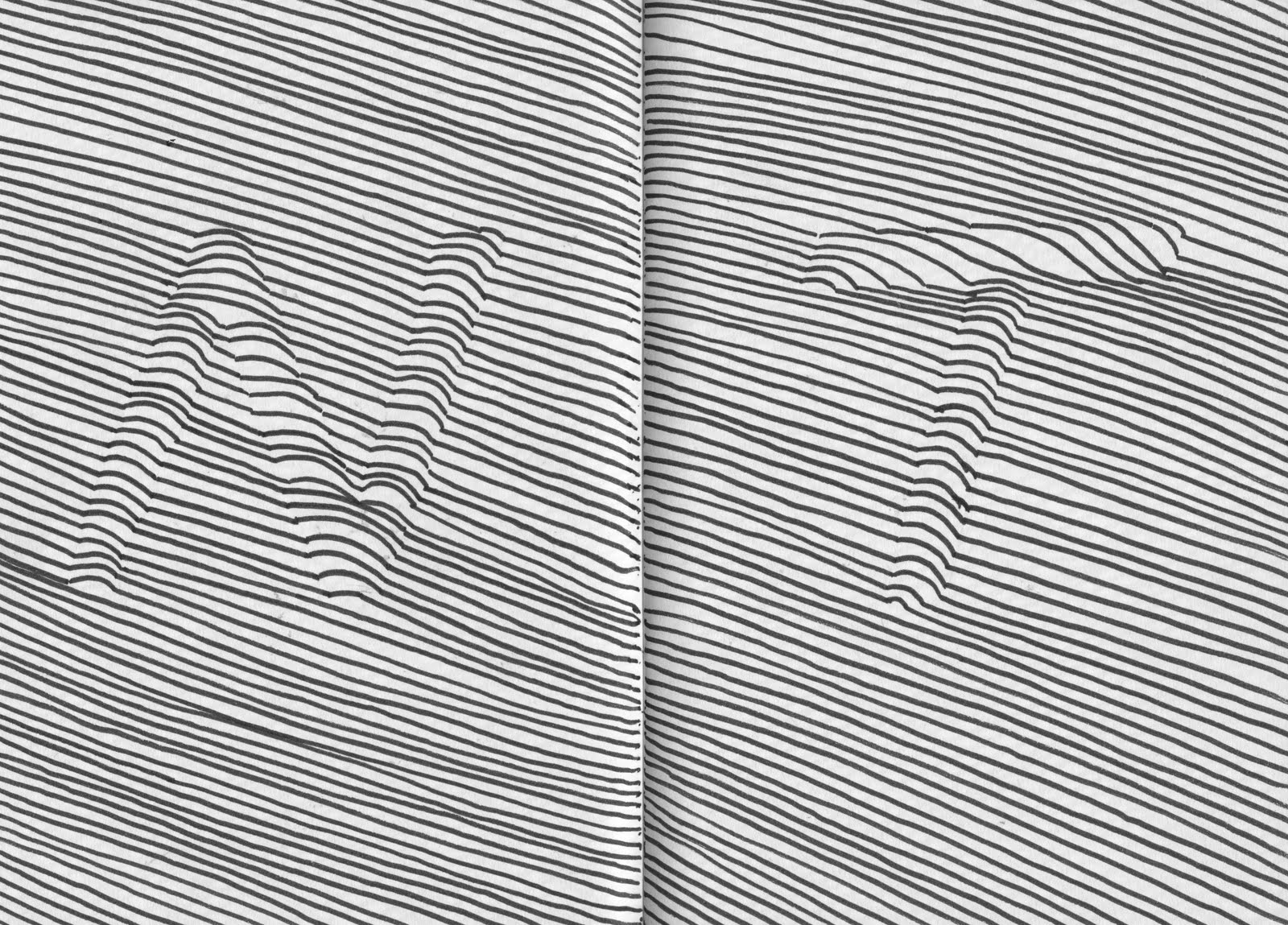
Images of my contour drawing in process...I was tracing from the contours on the map and altering direction slightly when I came across a letter that I had drawn on. This is what gives the effect that the type is lifted off the page

The finished trace laid over some type that I used for altering the contours.


Detail shots of the contours and the letters within them. Again these are images from the trace sheet. Detail is a little better on the live traced versions.
Edited illustrations...


I then went ahead and edited the images that I'd scanned from the trace to give a much cleaner finish with the hope of coming closer to a resolution...The majority of these have been done simply by increasing the contrast within the image and altering the levels so that the colours stand out from each other.
More drawing.


These images are all different examples of drawing on trace. Some have been traced from a map and others just drawn on the trace. However the map was very useful as it gave me reference and helped to draw without having to make it up, with the risk of it being obviously made up...
typographic sketches...what is a line?


Here is just a few pages from my sketchbook for what is a line that I have scanned. It shows my continued development of the typographic contour idea.
Subscribe to:
Comments (Atom)