Typografie board

Tuesday, 11 December 2012
Friday, 7 December 2012
typografia 2 - printed posters


Thursday, 6 December 2012
Typografia 2 - Final Tickets


The finished designs for tickets for the event, this includes both general admission and and admission for the talks. Same as the other printed matter, the colours correspond to the gallery in which the exhibition is being held, red for the Stedelijk in Amsterdam and off white for the Museum Fur Gestaltung in Zurich
Typografia 2 - Perforated tickets


Wednesday, 5 December 2012
Typografia 2 - Event Programme
Final spreads for the typografie event programme. This is how the book will appear when printed, however with it being a french fold the printing spreads will be rather different from these ones. It will be printed digitally, full colour, on off white sugar paper, as a lot of the promotions I have done up to this point have used sugar paper.
SF 2013 - finalising the app


Some updates to the app after talking with Andy particularly. Previously we were focusing on making it look like an app, adding gradients and background textures etc, and we possibly lost sight of a few elements that are important for an app. One of the main things to come from this chat with Andy was that the icons on the main screen looked out of place with rounded corners, squaring them off and having them over lapping like the tabs along the bottom of the page helped tie them in much better.
Typografia 2 - Final Talk Posters


Here are the final talk posters for the Typografie event for both the Stedelijk and Museum Fur Gestaltung. Similarly to the other promotions they are separated by stock, however for the experimental Jetset poster I have also included a second printed colour, as they are well known for using two bold colours in their works to pick out different information. In this case I used it to make the words more readable, as without these colours, it all blends into one word and can be quite difficult to make out, especially as some of the words won't be instantly recognisable.
Similarly to the previous event posters I tried to pick out elements within either the name or the designers work that could be portrayed through the poster just as an initial starting point for visuals. However I often find that these are the best examples and I choose these over more developed examples. These should be A1, especially the A2/SW/HK poster as the format is integral to the concept behind the poster.
Typografia 2 - Final event posters


These are the finished event posters as they will look when printed. the background colour will be the colour of the stock so when printing will only require one colour. They will however be double sided so that they can be displayed together as they are here, or on a window for example and have something to read on both sides.
Tuesday, 4 December 2012
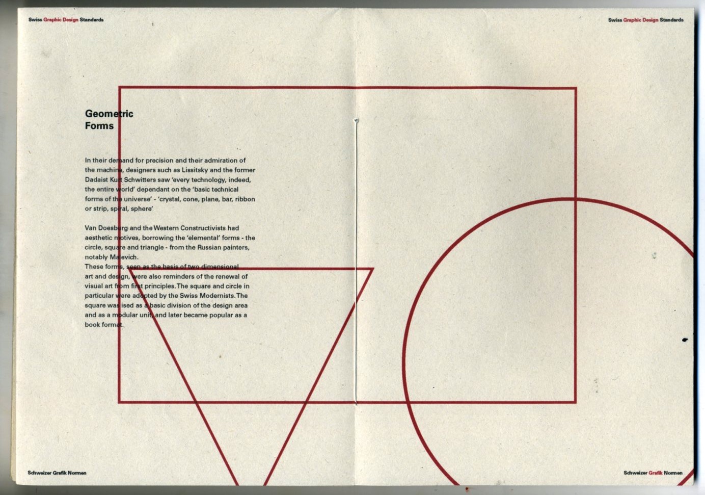
Standards posters - final spreads


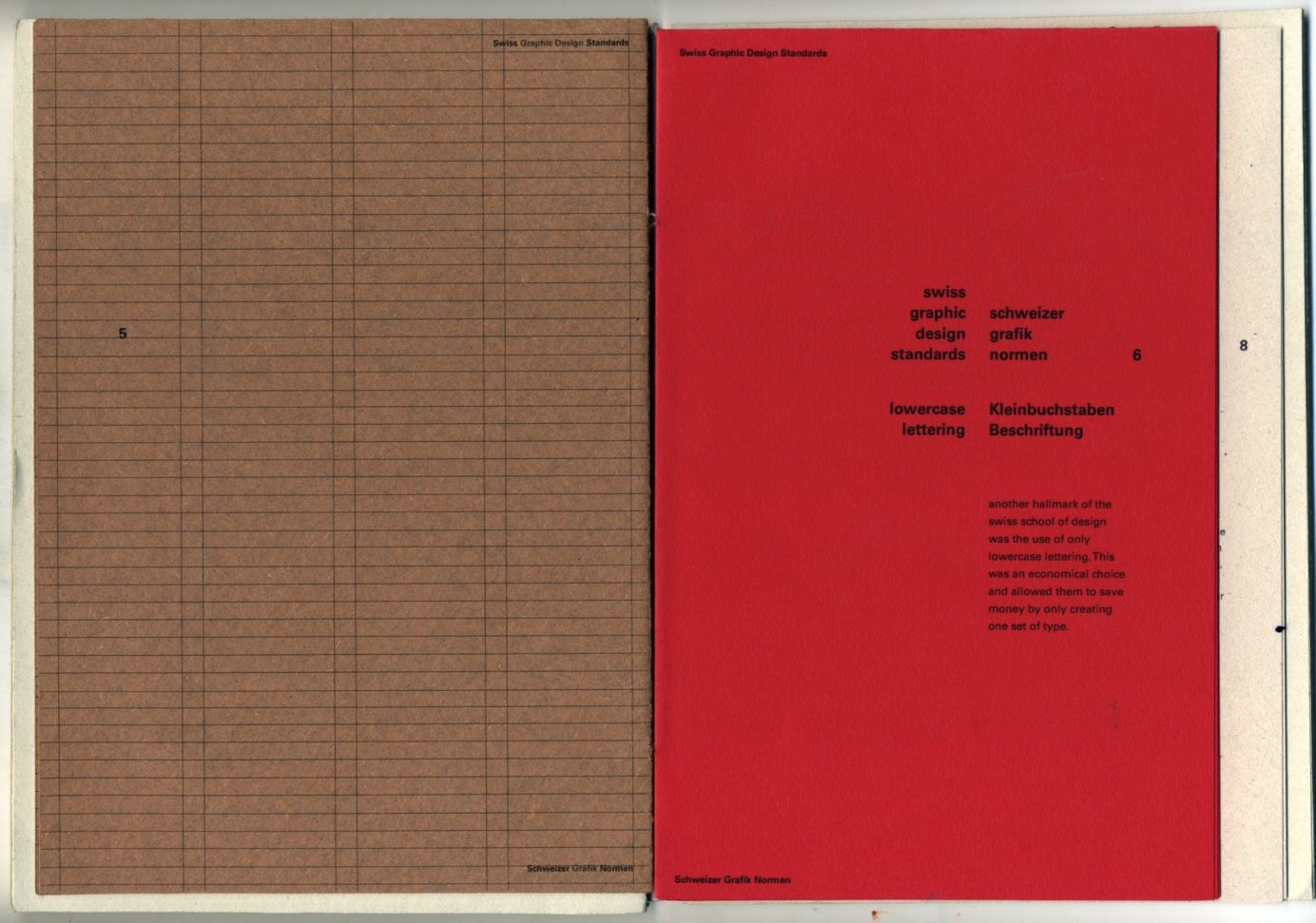


Final spreads from the standards poster book, scanned. Pleased with how this has turned out considering the short amount of time I actually ended up spending on it.
I think I achieved what I was going for in a rough and loosely bound book with pages of varying sizes, providing something a bit more interesting and tactile than a perfect bound book. This also wouldn't have been possible because of the nature of the pages being made up of folded pages. The folds allow the posters to read like a book on one side and a poster on the other, without either side affecting the other.
I think despite the amount of different formats, it still holds together really well as a book, probably down to the use of font and format.
Standards posters - final posters


Subscribe to:
Comments (Atom)