Form ~ writing boards

Showing posts with label Brief 1. Show all posts
Showing posts with label Brief 1. Show all posts
Tuesday, 11 December 2012
Thursday, 6 December 2012
Tuesday, 4 December 2012
Form and writing - publication cover mock ups.


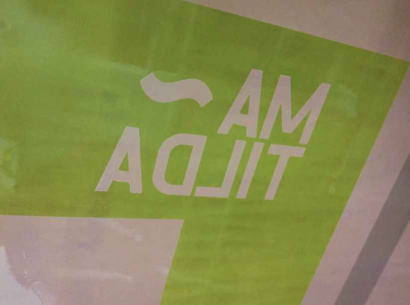
Some mock ups of little publications to promote Matilda, the font created for Form and writing. These mock ups are branded accordingly with Form and writings logo and details on the back allowing anyone to contact us if necessary. I thought it would be right to put the full font on the cover, and went with the idea of picking out the name of the font from the alphabet. This gave the alphabet a nice flow as I was having trouble laying it out evenly and this just gave a better aesthetic. Here I also went for a 60% black for the word Matilda within the alphabet just to set it apart from the other letters, however a varnish or emboss would be ideal for the actual publication. The ideas behind the covers, is that the fonts we create could all be presented in the same format with a different coloured cover, these could then be bound or boxed together as an annual.
Sunday, 2 December 2012
Form ~ writing - Inpress
As form and writing we were really lucky to be invited as guest designers to the Inpress Event. Here are photos from the event. It was a pretty successful evening all round and gave us a really great chance to get feedback on the stuff we were doing with form and writing. Notably we got some feedback from the creative director of The Beautiful Meme who'd paid a lot of attention to the font. Really good experience.
Form ~ writing - Screen Printing
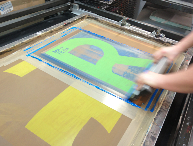
With Matilda now finalised, and the Inpress event on the way, which we were invited to be at as guest designers. We felt it was probably about time to do some printing so we had something to sell. We had each designed specimen posters, We had previously developed the screens so now it was just down to the printing.
We started with the first colour of my design, Which was a flat blue based on that found on road signs. With such a large printing area, we found that the paper very often stuck to the bottom of the screen. However it was often sticking to the enamel surfaces, where no ink was getting, so it may have been that the enamel had not fully set. The ink also ran out surprisingly quickly.


Next was the first colour of Joe's design, using the same blue. We used the colours almost to bring the series together as the designs were all quite different.
 Then the second colour of joe's design. Here are the final prints drying, The colours are really vibrant screen printed, far more vibrant than expected.
 Then we moved onto Yaf's prints, the main colour of his design being red.

 We did have some issues when printing Yaf's as for some reason the prints were coming out really nicely on newsprint but when we changed the substrate to thicker cartridge paper, it stuck to the underside of the screen and when removed the print was very mottled and grainy.
 However with persistence we did manage to get some really clean prints, and the addition of the information in blue added the finishing touch. Hopefully these will sell!

We started with the first colour of my design, Which was a flat blue based on that found on road signs. With such a large printing area, we found that the paper very often stuck to the bottom of the screen. However it was often sticking to the enamel surfaces, where no ink was getting, so it may have been that the enamel had not fully set. The ink also ran out surprisingly quickly.


Next was the first colour of Joe's design, using the same blue. We used the colours almost to bring the series together as the designs were all quite different.


Saturday, 1 December 2012
Form ~ writing - Thankyou slips


Just a little design whipped up from some marbled paper that we thought needed putting to use. Will make really good little thankyou slips for anyone that buys a print from the stall at the Inpress shop.
Thursday, 22 November 2012
Form~writing - screenprint
For the inpress event which we have been invited to as guest designers, we felt we should produce a series of specimen posters for the now finalised font we created. We initally wanted to produce 2 posters each, and we all designed a number of variations, any of which could have been used, but we felt that 6 would have been a good number of variation to have at a stall.
However when it came to the logisitics of screen printing all 6 A2 prints, each having at least 2 colours, we felt it may be better to have less variation but more volume, and choose one from each of us to have 3 overall. We felt it was quite nice that we all had a different take on the specimen posters, but all will be consistent in their colour and the information on the poster.
Below are the screen print positives printed at A2 scale.
These are the postives for the prints I designed, using my two favourite characters which are over layed to show the subtle differences and to mix the yellow and blue we've chosen to give a green like that of the british road signs.


Positives for the poster Joe designed.
Focused more on the curvature and subtleties of the letterforms using enlarged letterforms to create more abstract layouts.


Positives for Yaf's prints.
which breakdown the font into lines almost just giving a taste of the font to give a bit of intrigue. The information provides anyone that sees it with a method of contacting us about the font.


The screens in development.


Form~writing - Business cards.
While we were at Vernon street to expose screens we continued to experiment with our business cards using the embossing plates I'd made previously. We originally experimented with just greyboard and the impressions in the board were not particularly strong, especially as we were using 12pt goudy, which has some very fine details.
Yaf on the Nipping press used for embossing at vernon street.

After a few more impressions on greyboard, we realised we weren't really getting a distinct enough emboss, even after sourcing different weights of greyboard. So we decided to try a few on thick card, which we could then duplex in order to get the stiff, consistently coloured business cards we were looking for without the density of the heavy board.
 Again we tried a few times and got similarly dull results, even on the much thinner card. On speaking with one of the print staff he mentioned that when embossing onto book covers the impression is always much better on bookrum when it is already applied to the greyboard cover. So we decided to pad our card in the nipping press with greyboard, not really knowing what to expect.
It worked really well, below shows the visible difference in impression made with and without greyboard padding in the nipping press.
Original impression on black card without greyboard padding.
 Improved impression after using greyboard to pad the plate and stock

Original impression on white textured card without greyboard padding.
 Impression on white board with the greyboard padding...greatly improved

Yaf on the Nipping press used for embossing at vernon street.

After a few more impressions on greyboard, we realised we weren't really getting a distinct enough emboss, even after sourcing different weights of greyboard. So we decided to try a few on thick card, which we could then duplex in order to get the stiff, consistently coloured business cards we were looking for without the density of the heavy board.

It worked really well, below shows the visible difference in impression made with and without greyboard padding in the nipping press.
Original impression on black card without greyboard padding.


Original impression on white textured card without greyboard padding.


Tuesday, 20 November 2012
Form~writing - Matilda specimen posters.


The first few attempts at designing a specimen poster, revolved around showcasing the whole font and using an overlay to make the poster more aesthetically pleasing. At then end of the day, before promoting the font this has to be attractive enough for people to want to buy it, then they can think about the font.


However I also worked on creating posters using an example of a single character, with the rest of the font much smaller at the bottom but still present in the layout. Thought this was quite nice as I really like the Q, and I think it is a good example of some of the subtle features that make Matilda when it is blown up large, but also gives the opportunity to show how it would appear when placed much smaller.


I then went for a similar layout but altering the colour, because it was based on road signage I thought it would be relevant to try and get colour in from road signs to provide a nice link between its origins and where it is now. So my thought process here was to use yellow, with a road signs blue overlay, producing the green from road signs. Felt it would be more interesting to do it this way rather than just using the two flat colour on their own.


Subscribe to:
Posts (Atom)