Friday 26 October 2012

Typografia 2 - Initial Print tests


Print tests with initial ideas. Prefer the photographic example as I think it makes a little more relevant to the designers themselves and allows people to put a face to the designers work that they are going to see. Just not sure how this aesthetic can be applied throughout range. Also despite the print quality, quite like the simple one colour print using the stock as a way of adding texture and colour.

Typografia 2 - Range sketch


Here is a list that stemmed from this drawing of the range that I would like to produce for the Typografie exhibition. Although, looking at it, there is an awful lot due to the exhibition being based in two galleries.

Thursday 25 October 2012

Typografia 2 - Swiss designers.

 1/2

 3/4

 5/6


 7/8/9

 10/11

 12/13


14/15/16


1. Paul Rand
2. Richard Paul Lohse
3. Richard Paul Lohse 
4. Willem Sandberg 
5. Adrian Frutiger
6. Armin Hoffman
7. Armin Hoffman
8. Carlo Vivarelli
9. Josef Muller-Brockman
10. Karl Gerstner
11. Max Bill
12. Max Meidinger
13. Richard Paul Lohse
14. Jan Tschichold
15. Wim Crouwel 
16. Max Huber

Wednesday 24 October 2012

Typografia 2 - Research documents


Documents put together of a number of sources of inspiration so people can see where I am coming from in the crits.

Tuesday 23 October 2012

Typografia 2 (typografie)


typografia 2 - Initial Imagery


This is a very, very, initial poster designed simply so I've something to show at the crit in terms of the kind of imagery and use of type that I will probably employ. Quite obviously very Swiss in style and probably making use of minimal colours with the print process and using stock instead to get colour into the posters.

Typografia 2 - initial logo

The development of the logo type from typography (helvetica) through to the logo for the previous event, typografia (helvetica) to the development of  what I think is a slightly more relevant logo type for this event. Based on Swiss Graphic Design.

For this logo I chose Akzidenz-Grotesk as it's a font synonymous with Swiss Design and is easily one of the most popular fonts for the majority of Swiss Graphic designers. Certain designers such as Josef Muller-Brockman worked for a whole career almost solely in Akzidenz-Grotes.
I then took the ideas from the last logo type and applied them in the same manner to this one.

Standards posters - language standards


Another attempt at one in the series of standards posters. Tried here to stick with the same kind of layout as the previous poster, and although working with text I think I have achieved this here. Even if I were to go against the grid layout for the body of information (as it's rather restrictive) I think that the layout of information round the edges, defining which poster it is in the series etc, would still make it visible as one in a series.

Struggled a little to make this one quite as interesting because of the lack of visuals, maybe need to find something that I can use for each poster in the series, or just work with a different layout to make this particular poster more interesting.

Standards posters - Military standards.


Initial experiments with the Standards poster theme. Chose to look into Military standards as I knew this would be a topic with a lot of information, history and imagery to work with. I was not dissapointed, however, in terms of imagery th first poster I think, with all the flags in colour is far too much. With so many colours, in each flag and then so many flags it all becomes just a mess of colour. So although this then takes away the colours from the flags, which is very possibly the most important part of a flag, I think the black & white versions are much better/less offensive.

Adding a tiny swatch of the colours in each flag underneath should then provide anyone looking at the poster with enough information on each. Despite the inital problems with colour I am very pleased with the final result, and was nice to have the challenge of laying out so much information all different in so many ways.

Form ~ writing - European road signs. concept 1


Concept for the first font to be created by form and writing came from the idea of selecting type from the environment on google street view.  The majority of type in the images from street view was road signs and we decided to narrow it down by selecting European road signs.

Form ~ writing : meeting


Form ~ writing - finalised branding


This is the finalised branding for Form and writing, we made the decision that it best represented the idea that there was two distinct sides to the blog aswell as Form and writing as a process driven type foundry.

Form represents our individual and collective research, showing the things we are interested by and the influences on our own work.

Writing represent our work and the presentation of the process through which we achieved our final resolutions and typefaces.


This branding will be applied to any material we produce aswell as a full stantionary set that will represent the more professional side of form and writing :
- CDs
- Business cards
- Letterhead
- Compliment slip
- Envelope
- Notebooks
- Rubber
- Pencil

We also spoke about the idea that our stationary set is almost on a rotation, and could change monthly with each new typeface or specimen produced. The notebook mentioned relates to the randomly posted cutting mat, as we had an idea of using a cutting mat as the cover for a notebook, which we would tailor to type designers.

Form ~ writing Business cards


Form ~ writing - scans


Some of the initial idea sheets aswell as the finalised branding and some stationary ideas.

Form ~ writing - Cutting mat


Yaf had the awesome idea of using a cutting mat as the cover for a notebook that we could add to our stationary.  making it hard wearing and useful aswell as being a notebook. Logistics of binding it may be a little tricky though.

Tuesday 16 October 2012

Form ~ writing logo development

Initial logo ideas looking at variations in format and the connecting word/glyph. Set in Garamond and ITC Caslon initially making use of weights and italic to break up the logo.


Looking at the addition of a sans serif element to further make the distinction between the two sides of the logo.

Much bolder and less relevant experiments with the wording and layout.
 Abbreviating.
A look at another layout, this time stacking the words as opposed to the previous sentence structure, addition of the hyphens to keep the idea of there being a distinct difference between the to sides.


Continued experimentation with colour, layout and the glyph used in breaking up the logo. Initially very much liked the examples above making use of a cross, however moving away from this in current developments of the logo.

Friday 12 October 2012

Form ~ writing logo sketches.


Chosen Significant briefs.

Form & Writing
I am going to work collaboratively in the creation of a number of typefaces and supporting work including type specimens and an online resource because I want to develop the skills needed to create typefaces and further build my skills in type & layout

-

Week 1: initial ideas
Week 2: Finalise logo & branding, get blog online 
Week 3: Research chosen concept (font 1)
Week 4: Initial ideas and font development 
Week 5: Finalise font and initial ideas for specimen.  
Week 6: Specimens to print 
Week 7: Research chosen concept (font 2)
Week 8: Initial ideas and font development
Week 9: Finalise second font and develop specimens 
Week 10: Specimens to print

-

A typographic investigation into font design with a focus on print & online delivery.

-

Product – online resource, typefaces, specimens and annual publication.

-

Range
-    Typefaces
-    Type specimens
-    Type prints
-    Posters
-    Type annual
-    Logo
-    Blog
-    Identity
-    Possible event
-    Event promotion
-    Flyers
-    Event posters
-    Various printed objects

Distribution
-    Online
-    Blogs
-    Event
-    Pop up shops
-    Online type resources
-    Print fairs
-    Exhibitions
-    LCA gallery
-    Social networks
-    Website


SF 2012
I am going to collaborate in the creation of an informative guide to the alternative side of San Francisco because this will further develop my skills in both research and publication design.

-

Week 1:
Week 2:
Week 3: Concept development, research
Week 4: Design development  (publication)
Week 5: Evaluation and selection, production and resolution  (publication)
Week 6: Production and resolution  (publication)
Week 7: Design development  (collateral)
Week 8: Evaluation and production  (collateral)
Week 9: Presentation and submission
Week 10:

-

An audience based investigation of alternative tourism in San Francisco with a focus on promotion through publication design.

-


Product – Alternative tourist guide to San Francisco

-

Range

-    Publication
-    Pocket travel guides
-    Web
-    Social network

Distribution

-    Online
-    Travel Agents
-    Word of Mouth
-    Pop up shops
-    Mail outs/Direct Mail
-    Email


Typografia 2
I am going to create the identity and branding for a second typographic exhibition under the typografia name because I want to develop my skills in branding and exhibition identity aswell as continue to work on probably my most successful brief from last year. The research side of this will allow me to make links to my dissertation and further my knowledge of typography, hopefully informing my own practice as well as that of my dissertation. 

-

Week 1: Recap previous event and research concept 
Week 2: Concept development and continued research
Week 3: Concept development and continued research
Week 4: Initial designs
Week 5: Development of identity
Week 6: Continued design development 
Week 7: Application of identity to promotion
Week 8: Application of identity to exhibition space 
Week 9: Send relevant material to print
Week 10: Final printing and binding of catalogue

-

An event driven investigation into Swiss modernist graphic design with a focus on print based event promotion and collateral.

-

Product
– A typographic exhibition with talks from relevant designers. 

-

Range

-    Event
-    Event promo
-    Posters
-    Flyers
-    Billboards
-    Prints
-    Postcards
-    Tickets
-    Web presence
-    Event publication
-    Event signage
-    Event identity
-    Logotype

Distribution
-    Internet
-    Posters
-    Flyers
-    Social networking sites
-    Professional networks
-    Design museum
-    Creative publications


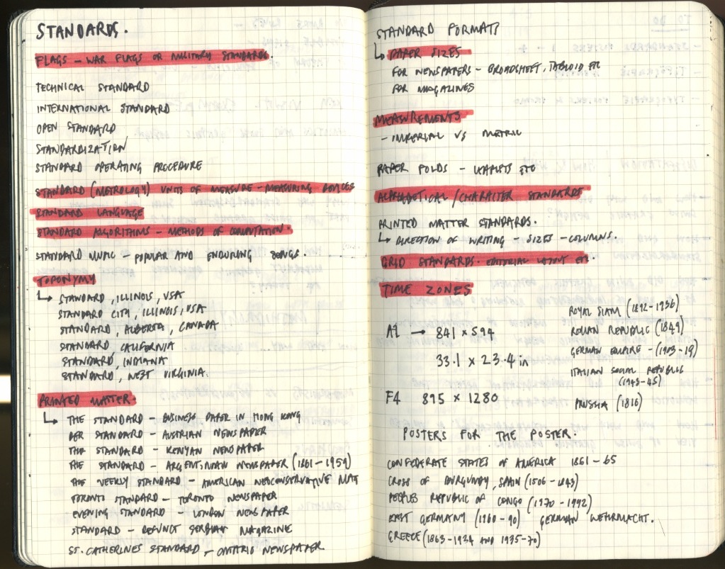
Standards poster series
I am going to develop a series of posters based around the term standards because it allows me to develop a body of research relevant to my dissertation as well as acting as an exercise in type & layout. As a personal project this should provide a welcome break from heavier projects on a weekly basis whilst still acting as a good basis for developing in my ability to present large amount of information.

-

Week 1: Research into standards – overarching concept, poster
Week 2: Research specifics, poster 
Week 3: Research specifics, poster
Week 4: Research specifics, poster
Week 5: Research specifics, poster
Week 6: Research specifics, poster
Week 7: Research specifics, poster
Week 8: Research specifics, poster
Week 9: Research specifics, poster
Week 10: Research specifics, poster, print

-

A skills driven investigation of type & layout with a focus on the creation of a series of posters around the theme standards.

-

Product
– Range of posters exploring the term ‘standards’ typographically, along with a series of publications.

-

Range

-    Series of posters (weekly)
-    Zines/small publications

Distribution
-    Book Shops
-    Online
-    Networking
-    Creative Events
-    Pop up shops
-    Galleries
-    Student fairs
-    Online print sales