Very initial ideas for the spread, introducing the (unvectored) image of the crow and a quote)
Starting to add greater detail such as drop caps and page reference.
further experimentation with page referencing, adding numbers at the top aswell as at the bottom of the spread.
Altering the position of the references.
Change of typeface for the header and positioning of the strapline.
changing the references at the top again.
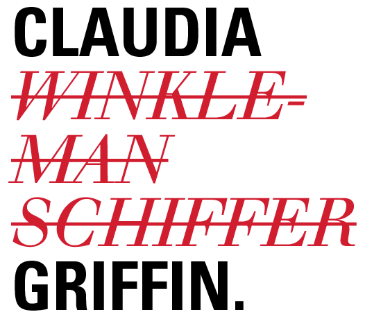
Re-adjusting the header and a change of face for the strapline. This one is Justus.
Looking at changing the page reference format at the bottom of the page, prefer the previous format.
Change of the header to Justus in Caps
Removing details from the centre. looking at simplifying the layout.
Trying lines across the page, again I prefer the original format of these references.
Looking at differing line lengths for the pages.
Back to the previous format, this time including Claudia's hair vectored.
Looking at the inclusion of a breakout quote. changing postion, point size and font.


