Good is the feeling that nothing is impossible when skateboarding.
Why?
1.Can go into anything without fear
2. It helped man to achieve great things.
3. Skateboarding would not be where it is now without it.
4. It's a natural high
5. Could make you look really cool.
I intend to promote to a group of skateboarders between the ages of 7 & 47 that nothing is impossible. In order to achieve this I will produce...
Product
Branding & promotion/ design and a fictional event for the brand launch/
Range
Logo/board designs/promotional material for brand & event/stickers/hardware design.
Context
The
brand will exist as a whole, however the event exists as a promotional
catalyst for the brand. This should allow it to be seen by as many of my
target audience as possible.

Monday, 31 October 2011
Sunday, 23 October 2011
Good is... Concept crit.
PEER FEEDBACK
Comment on the extent to which initial research and development of the concept demonstrates a significant understanding of the chosen subject matter.
Initial research is good, a lot of content to work with, think the concept needs to be rethought to be more focused, too vague at the moment. Does it need to be specific to skateboarding?
satisfactory - good
Comment on the extent to which the concept proposal exploits the practical and conceptual investigation and application of design for print.
There is a lot of ways in which you can apply print with this. Organising promotion for an event, skateboard designs. Once you have a more focused concept, it'll be easier to find out what you can work with.
good
Comment on the proposed range of products to be produced in response to a clearly identified problem.
Linking to an event is a good idea, (festivals), places where people feel free! ie festival promotions - large scale, applied to various things (pad printing) posters flyers, mailshots...
satisfactory - good
Additional comments
Focus your design ideas around an event.
Research in depth how to print onto skateboards, wheels etc - if not possible for you to do, mock up on photoshop. Try printing onto vinyl and then sticking on...
Strayed away from 'Nothing is impossible' back to skateboards
Event focusing on that statement - extreme sports - being spontaneous - sports clothing?
Think this was a really useful crit and have discovered I should probably move away from making happy meal packaging and focus on some actual design. I think going with a different colour scheme, one of the earlier ones making use of a teal blue or blue background with grey bolt would be much more effective.
Rationale.
Good is the feeling that nothing is impossible.
Why?
1.Can go into anything without fear
2.Gives determination & motivation to achieve
3.Without it, masses of information would be undiscovered
4.It's a natural high
5.Gives people faith
I intend to promote to a group of skateboarders between the ages of 15 & 45 that nothing is impossible. In order to achieve this I will produce...
Product
Branding & promotion for a skateboarding hardware company
Range
Packaging // decks // product aesthetic // logo // posters // editorial adverts // t-shirts etc
Context
Skateshops - skate magazines - on products.
Saturday, 22 October 2011
Good is...? Concept crit 1
Strengths
Skateboarding - good idea for branding/printing (onto boards etc)
Strong logo.
Areas for improvement
More focus for ideas
Statement and product need to be linked and communicated more securely to the audience. (at the moment, needs to be explained)
Whats your specific audience?
Safety wise
Should you be advertising extreme sports to young people.
Additional comments
Think of alternatives to the product that you can promote - made up events etc...
opens up possibilities for different promotional material.
Look at extreme sports magazines
Look at the strong man competitions, spartan race etc.
Research printing onto boards and wheels etc but just mock it up/ focus on do-able range of deliverables.
Friday, 21 October 2011
Wrap it up - crit feedback
Strengths
- Good creating quality.
- Carton is well composed, the idea of reversing the orientation really is a different take.
- Logo image is very strong.
- Upside down type is a good idea for helping contextualize the logo.
Areas for improvement
- MacDonald's colour scheme needs readressing slightly.
- Look at the inside of the packaging, how can that be changed?
- Type on carton would work better if it only went across three panels.
- Font is like Macdonalds...
Really useful feedback that helped me to pick out some issues that definitely need addressing.


Thursday, 20 October 2011
mock-up packaging


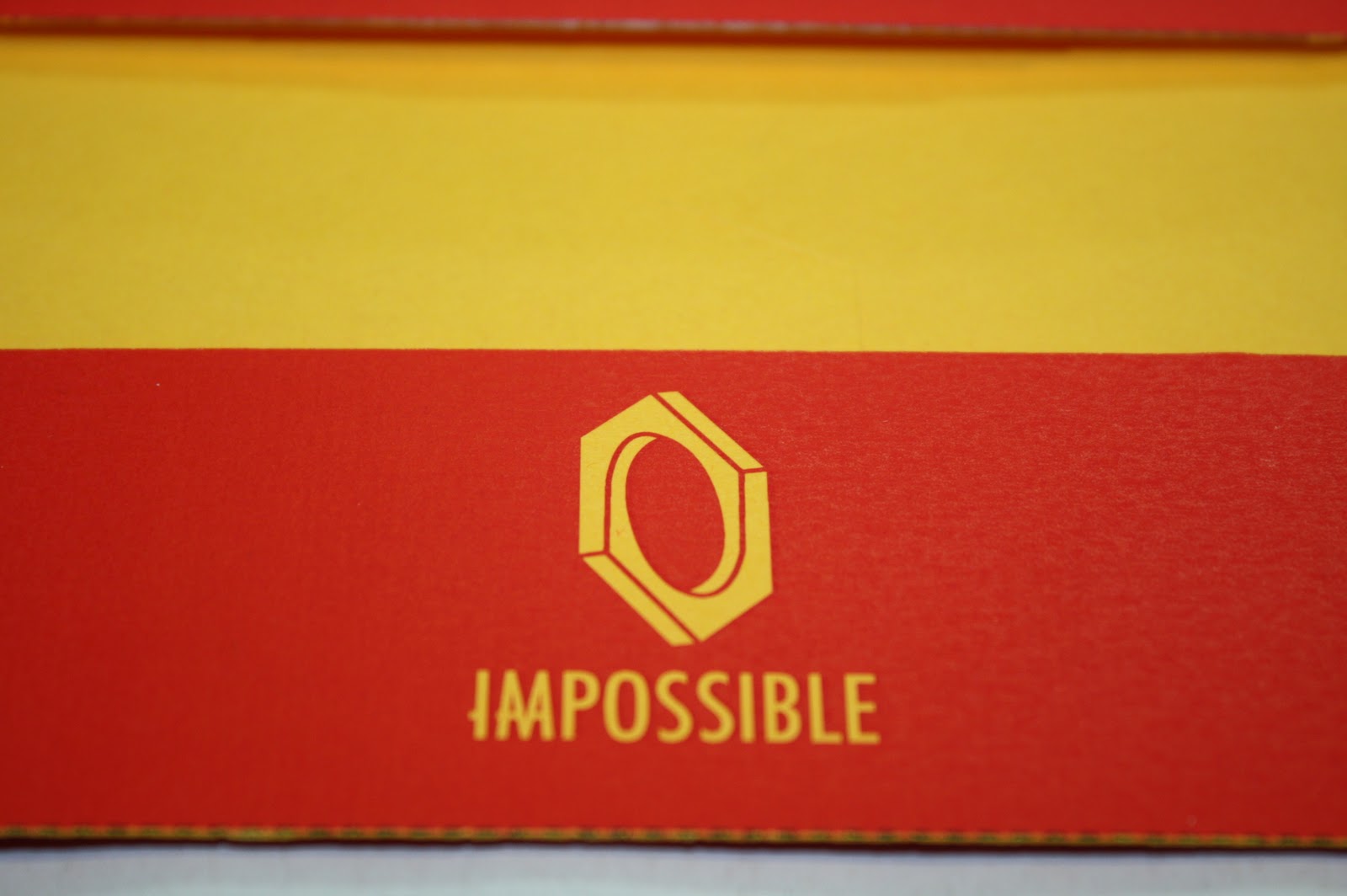
Pictures of mock ups on yellow stock printed black and white, or in this case black and yellow... These were just to get an idea of how the nets were going to fit together and how the logo would appear reversed out from the flood colour on the yellow stock . I like the simplicity of these designs.
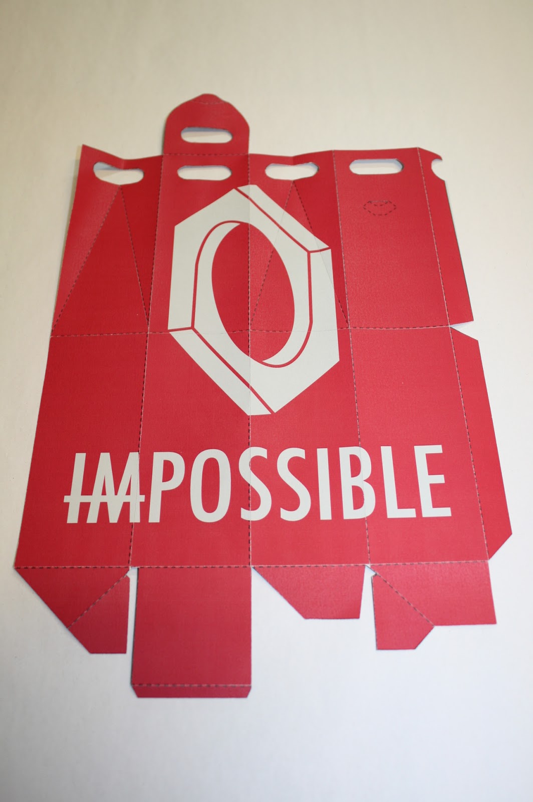

Photographs of the box net packaging making use of a different stock in a pale grey with the same bright red printed over. I really like how this gives such a different effect, changing even how vivid the colour red is, and the contrast between the two.
Packaging - digital development


Above is development for my first flat net packaging and I have looked mainly at the implementation of my logo onto the net and the colours used. From stock experimentation with printed logos I found that the logo looked really strong in red on yellow stock. SO other than the black experiment in the bottom right, it is assumed that all of these would be printed onto a bright (mango) yellow-orange stock. personally, I like the simpler designs, applying the logo centrally onto the envelope with the flood red backdrop.


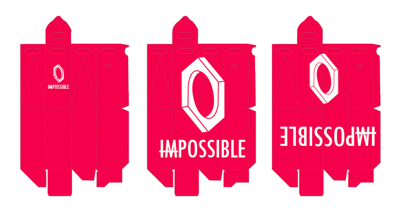
Here are more examples of digital packaging development that look at the second envelope net. Another net which creates a square format when made up and placed flat, however it is possible to work with an part of the net. For this one I was slightly looser with stock consideration and was designing regardless of stock, so there are examples that would be best to stay white and also those that would look better on a coloured stock. The majority of the designs have white in them however, so it would eed to be a stock that gave a good contrast the colours used. Here the designs I prefer, were those I looked at applying my logo differently. Such as the examples in which the nut is placed where the two sides of the closing section will meet to create the logo ( I am aware in these that the section of the logo on the tab is placed wrongly, however I moved it when printing the designs).

Some development for the larger net, that creates a standing package suitable for bottles and such like. I looked here mainly at how the type of the logo interacted with the net itself. Some here, I also placed it upside down as I quite liked the idea of something a little harder to read, to give it a bit of intrigue, and something a little different.


Finally a series of developments of the third flat, envelope like net. Here I looked at a range of colour schemes and ways to implement the logo. As this was the first one I worked on I was able to apply knowledge from the creation of this net onto the development of the others. I looked a lot at repeatable pattern on this net, however I think these repeatable patterns are very busy. Knocking these designs back in opacity to around 40% and placing them inside the envelope could create a really interesting effect.


Wednesday, 19 October 2011
Logo stock experiments.


Experiments with logos on both a fairly heavy (around 150gsm mango stock) and on standard copier paper, just so I had something to go on in terms of print quality of the logo on a heavier stock and also ideas on stock colour for moving on with packaging development. The ones that stand out for me are the bright red and process blue examples on the yellow stock and also some of the paler blue tints on the copier paper.
Subscribe to:
Comments (Atom)