> Active window highlighted with yellow Outline
Composition > new composition
Preset : PAL D1/DV Widescreen square pixel
25fps for PAL
Standard fps for England.
Hours : Minutes : Seconds : frames
with RGB :
> Black represents nothing > additive colour mode
> opposite to print
Composition > composition settings > allows changing of composition
Layer > new > solid (to create a new layer/shape)
Dragging the block on the timeline allows you to simply change the amount of time it's on the screen/in the composition.
Current time indicator is a good way to check how the composition is looking
Pressing 'Space' plays through the composition, but for complicated compositions it can stutter & be slow!
Decreasing the quality will improve the realtime playback of the composition > will only affect on screen viewing, not the final rendered video.
Command + & - zoom in the composition window.
Zooming in on the timeline
>gray bar above
> dark gray bar below does the same (with mountains on)
Tilda key ( ~ ) maximises the selected panel.
Layers > transform
> allows you to alter the layer in a variety of ways.
Keyframe
> interprets what needs to happen between certain points to allow a change of shape etc.
to create the first keyframe.
> Note the position of the current time indicator > move it to where you want the keyframe
> click the stopwatch on the chosen transformation
> move the shape & the current time indicator.
The software fills in the gaps.
Can copy & paste key frames
Holding alt and dragging them allows you to change them relative to where you have them. If the timing of the elements is important.
Thick gray bar beneath the timeline
> work area
> allows you to loop stuff and restrict the rendering amount to reduce memory usage.
can decide on a shapes movement by altering the bezier curve.
Keyboard shortcuts.
> anchor point > A
> scale > S
> rotation > R
> opacity > T
> position > P
In > I
Out > O
} move to the exact in and out points of each layer.
Begin > B
End > N
} Moves to the beginning and the end of the work area.
shows all animated layer } U
shows all modified properties } Double tap U
Exporting
If it doesn't fill the duration.
Select longest object > O - N > moves the work area to the right place for the export.
Composition > add render queue
Output module > format > quicktime > format options
> H.264
Output to > user work > mov file
then save somewhere away from user work so it isn't deleted.
Untitled from Max Gregory on Vimeo.
The finished video from the session... amazing.

Tuesday, 29 November 2011
Tuesday, 22 November 2011
OUGD201 self evaluation
1. What skills have you developed through
this module and how effectively do you think you have applied them?
Throughout this module I think I’ve developed in my
ability to use colour within my design work, applying everything we’ve learnt
about production for print fairly effectively in order to achieve some
interesting results. I think I have also benefited from the type sessions, the
skills from which I have been able to apply to any typographic layouts
throughout this module. I think this will prove invaluable as I progress
further into the course. Finally, the main thing I can take away from this
module is a much greater appreciation for commercial print, both in the
preparation of the design for print and in the processes themselves. Another
skill I feel will prove invaluable moving forward.
2. What approaches to/methods of print production have you developed and how have they informed your design development process?
I think throughout this module I have had much more of
an appreciation for the print production processes that I want to apply to my outcomes.
Despite a lot of them not being available in college I was able to propose what
I wanted and think about visuals before actually printing.Working with ideas
on screen allowed me to be more creative when thinking about the resulting
outcomes.
3. What strengths can you identify in your work and how have/will you capitalise on these?
I think the main strength I can identify in my work for
this module is visual consistency, and in branding this is very useful. I have
been pleased with the majority of the artwork I’ve created and in how it has
come together to make a whole body of products for the main brief. I think I
can capitalise on this for any brief as it is usually important to have
consistent visuals for a single body of design.
|
4. What weaknesses can you identify in your work and how will you address these in the future?
I think the main weakness I can identify through this module is hand rendered work and my ability to work at a consistent pace throughout. I find that my motivation is unevenly spread throughout the module and seems to come into play towards the end of the module when the pressure is on. If I were working at a more consistent rate, giving myself daily goals to work towards I think I’d more likely get a more rounded body of work.
I think the main weakness I can identify through this module is hand rendered work and my ability to work at a consistent pace throughout. I find that my motivation is unevenly spread throughout the module and seems to come into play towards the end of the module when the pressure is on. If I were working at a more consistent rate, giving myself daily goals to work towards I think I’d more likely get a more rounded body of work.
5. Identify 5 things that you will do differently next time and what you expect to gain from doing these.
-
Try to stay
motivated throughout the brief by setting myself regular goals and things to
achieve in a restricted time. This will make me get on with the work earlier as
I find that when I write to do lists I have more motivation.
-
Try to be
decisive in the early stages to save myself from falling behind whilst deciding
on concept.
-
Try to blog
as soon as I do things in order to prevent work from piling up towards the end
of the module when I could and should be getting on with more important
elements of a brief.
-
Plan ahead
in order to allow myself time to produce what I want to, for example preparing
my screen earlier in screen print so that if anything should go wrong with it,
it isn’t the day before the module hand in…
-
Use research
more effectively in order to gain more extensive knowledge of printing
processes and also processes available around college. This will allow me to plan
my time better in order to fit in the processes I want, think before the
production in order to book inductions/get drop-in when using college
resources.
6. How would you grade yourself on the following areas ?
Attendance 5
Punctuality 5
motivation 3
commitment 4
quantity of work produced 3
quality of work produced 3
contribution to the group 4


Presentation boards
Open publication - Free publishing - More graphic design
The completed presentation boards for Print production.
The completed presentation boards for Print production.
Monday, 21 November 2011
Mock up attempt

Print top 10s. revised.
Open publication - Free publishing - More editorial
Print top 10 revisited. Very simply altered, changing a few grammatical errors and and removing some placeholder text.
Print top 10 revisited. Very simply altered, changing a few grammatical errors and and removing some placeholder text.
Creating the final product manual.
The process began with piling my pages up in order and gluing them down the bound edge to give a solid layer holding them all in place, with the least amount of page lost possible. After a few layers of PVA I then applied the spine. Which was a 10mm piece of fairly heavy mango stock, scored centrally with a 2mm spine.

I then folded this spine around the glued area of my pages and pushed it as far against the spine as possible. This gives a straight spine and ensures that all the pages are held in tightly.

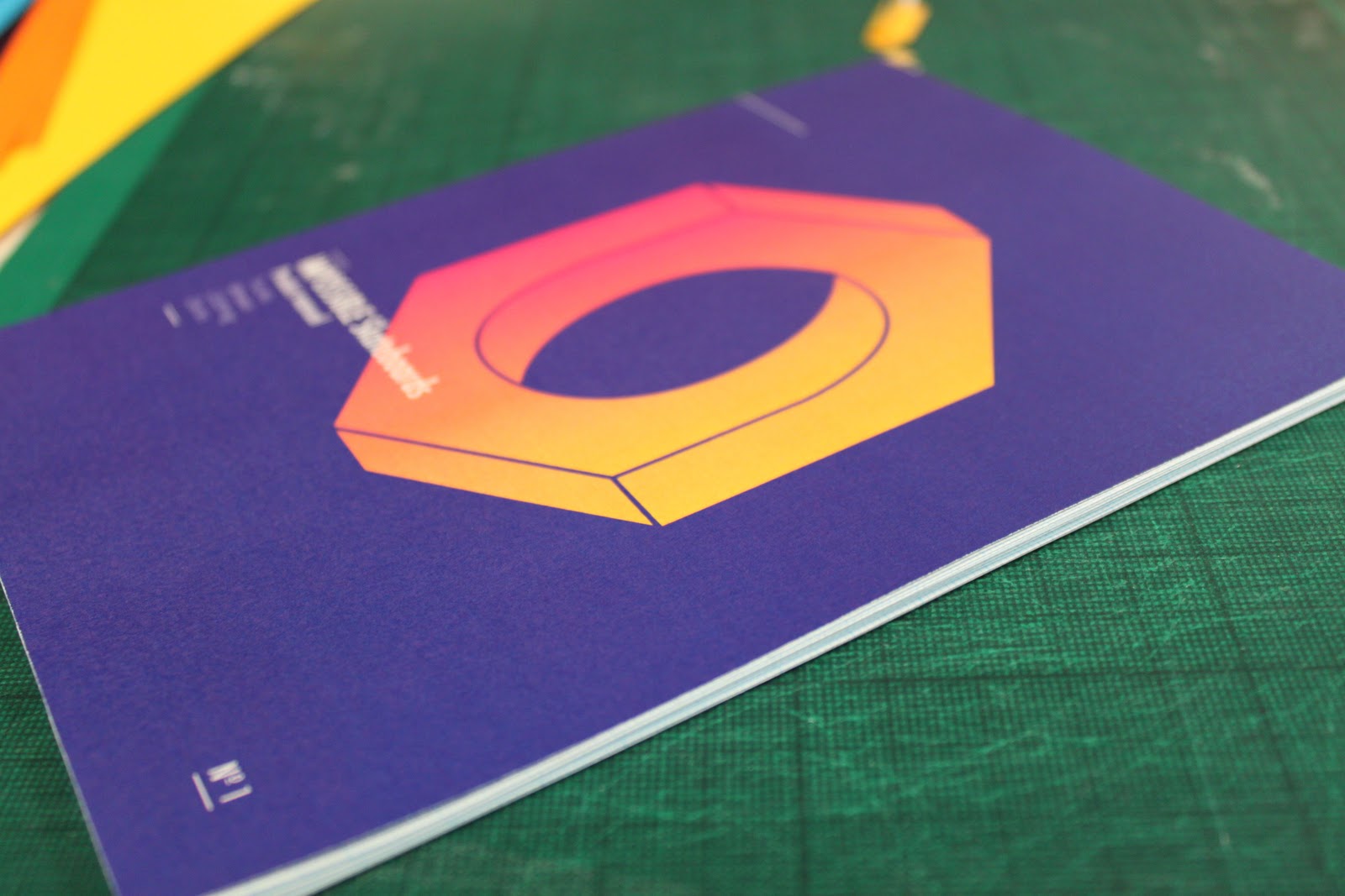
On close inspection the spine is looking quite nice, with a crisp edge and straight fold.

A look at the spine applied to the book from the back.

the spine from the top down, showing how it holds the pages and bind in place.

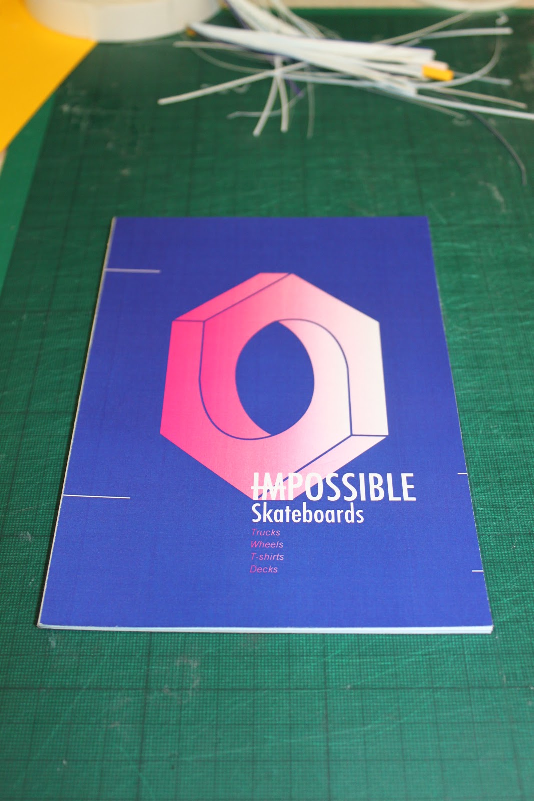
Then apply the front cover using a thin strip of double sided tape applied only to the yellow spine.

Then apply the back cover in exactly the same way.


Then comes the trimming. This should give a really clean finish, if it's straight.

The finished product. Relatively pleased.
A LOT of time ... WASTED.

So promising... screens ready on the printing bed.


After pulling the screen...trepidation, expectation, anticipation...shit

Screen print negatives.

Deck, one for white background and one for a cyan overprint.

Above for navy blue or darker print. Below for orange or bright colour overprint, instead of foil.
Friday, 18 November 2011
Stock test

Navy blue print on orange.

Navy blue print onto cyan.

navy blue, magenta and yellow print onto off white.

detail.

back detail.

inside cover.

Navy blue onto and magenta onto orange stock.


back detail.

Detail.

Bronze foil onto copier paper.

Detail.

Foil shine.
Mock-up product manuals. Bind.

Mango stock with deep blue flood background (goes black on the yellow) a magenta gradient logo and text. Yellow bind held over the covers. Like this bind however I think it could do with some refinement.

The detail.

The back.

The bind.

The front.

Cyan flood background on the same stock (goes green...) , again with magenta gradient on logo, however a much simpler typographic layout, giving only the vital information.

the bind.

The back.

Black print onto standard copier paper, looking at the effect stock weight has on the books feel and strength. back to my original type and logo arrangement.

The bind. (cyan stock scored to give a crisp as possible fold, covers placed on top of bind)

The back.

Orange/bronze foil blocked copier paper done on the laminator in the library. Really just looking at the finish provided by the foil block but thought I'd kill two birds with one stone and test a similar binding technique with a different cover.

The foil.

the logo.

the bind.

the back.

My very first binding mock-up that I presented at the final crit. Done with a standard booklet bind, folding all the sheets and placing them one on top of the other, the cover then wraps around this. Found out (from the crit especially) that the flood background isn't good with the fold, because aswell as cracking from the folding itself, it got worse as people handled it more and more. Hence the mock-ups for different binding technique, all of which negate the need for a fold...

the edge - the staple.

The back. (ideally the orange overprint would be a gloss orange foil)
Another mock-up. This one the same as the very first in this post however it is printed onto white stock. Shows more how the stock affect the printing. I really like this navy blue against the yellow magenta gradient however, so I think I'll have to print onto a white stock.

The back.

The bind. crisp.
Subscribe to:
Comments (Atom)