
select shape/artwork
1. colour picker on the left (fill & stroke)
2. swatches menu on the right - probably the best option making use of colour libraries for consistency.
3. colour picker at the top right (toolbar)
1.

2.

3.
clearing swatch palette.
- drag individually
- shift click to select multiples
- palette menu > select unused > bin.
Print/trim/crop/registration marks
Printers marks are to do with the registration of print commercially. They help to line up each colour when working with offset printing processes. This means that the print will be clear as possible with as little misprint as possible.
Adding swatches to palette
Use the colour picker > picker menu > create new swatch
Swatches palette > menu > new swatch > mix colour
Good to sort out the palette before starting when you know exactly what colours you're going to use.
Swatch view
Swatch menu > small list view > more information.

Colours used
Swatch menu > add used colours > all colours in document will be added to the swatch palette
This gives little grey box next to the colour
> meaning the colour is global
Global colours
Global suggests a whole
when these colours are edited, all artwork with this colour will change too (without having to be selected)

> don't get four CMYK sliders
> get a single tint slider
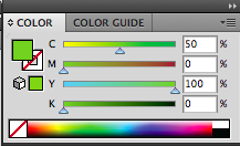
Can then create new swatches of the colour tint / 100% 50% 25% etc. Image shows pantone 180 c as a global colour.
Editing the 100% value of a global colour will also edit all it's tints in the document!
Spot colour
- A colour that can't be printed with CMYK
- spot colours are ready mixed inks, they are not created by printing with CMYK
- Requires it's own printing plate in commercial print.
good because...
> can print colors that aren't printable using CMYK - flourescent colours etc.
> Cost - cheaper to print with less plates and so on, cheaper than printing with 4 plates
cost considerations.
> also spot colours are used to achieve consistency in print. CMYK can still allow slight variations in colour - good for branding and such where colour is very important.
PANTONE - colour reference systems...
Works with pantone references. Can get exactly the right colour from the reference numbers...

Swatch palette
> open swatch library > colour books > small list view (gives reference numbers)
> show find field > gives search bar
clicking a colour will add it to the swatch palette
Would need a printers proof or reference book to properly proof colours however they can be expensive.
> commercial printers are needed for accurate spot colours, as these cannot be represented well in CMYK, college printers will not faithfully print them.
NEVER CHANGE THE NAME OF A PANTONE SWATCH AS THE REFERENCE NUMBER IS VITAL FOR THE PRINTERS
it is possible to change the pantone colours to their closest CMYK equivalent using the colour picker > there is also a pantone process colour book, which are made up of process colours.
Selecting positive in the print options will give the seperation layers > good for screen printing an such where you need the seperations from the artwork.
> it's possible to convert all spot colours to process in output, in order to alter the colour values for CMYK printing.
Swatch libraries
Can save libraries for future access on other documents > useful again for branding, when the same colours will be used throughout the project.
Library menu > save as Ai - accessible i any illustrator file
> save as ASE - accessible from any adobe software

to open saved ones.
Swatch menu > open swatch library > user defined.