SF 2013 boards

Showing posts with label Brief 2. Show all posts
Showing posts with label Brief 2. Show all posts
Tuesday, 11 December 2012
Thursday, 6 December 2012
Wednesday, 5 December 2012
SF 2013 - finalising the app


Some updates to the app after talking with Andy particularly. Previously we were focusing on making it look like an app, adding gradients and background textures etc, and we possibly lost sight of a few elements that are important for an app. One of the main things to come from this chat with Andy was that the icons on the main screen looked out of place with rounded corners, squaring them off and having them over lapping like the tabs along the bottom of the page helped tie them in much better.
Tuesday, 4 December 2012
SF 2013 - guide colour pages


We initially intended on having some of the pages of the guide in colour, mainly on reviews with full bleed images and also on these pages with little notes in the corner. However when printing on the laser printer it gives this shiny finish on the colour spread. Because the rest of the guide is printed black and white, these pages are matt, so the difference becomes quite noticeable.
We decided to go against these coloured pages and have these informational notes in a black box instead.
Sunday, 2 December 2012
SF 2013 - Initial App development


Here we looked the creation of the app that would accompany the printed guide. We first started by looking at the holding/opening page and a way to show the name that we had decided on, Mapp, typographically. Apps very often use a lot of shadowing and gradients to give a slick and clean appearance, so we attempted something similar.
However not really sure on this aesthetic, however there are things that can be taken from this, like the tabs along the bottom of the page and I Think the type for Mapp makes it fairly obvious what it is. Before the inclusion of the line beneath the type it looked like it was mis-spelt.
SF 2013 - Initial App

Very first test with the opening screen for the app. The type on this I don't think works, as it is a bit text heavy down the left. Nor does the 'Mapp' logo work particularly well as there is no way to differentiate it from a mistake. Needs a lot of work, as it seems to look very flat in comparison with most apps.
SF 2013 - Mock bind with spreads


this bind test should give us an idea of how the spreads work when bound, and also the best way to bind and trim the book in order to avoid cropping any of the page or text off. Here we have included the coloured end pages for each signature, these provide a good marker for the start and end of each section of the guide.
SF 2013 - Wrap stock choice


Stocks chose that we thought would represent the cities well, whether it be because of the names eg. new york - big apple - green. or just because it was a colour we could relate to them eg. Brazil - yellow. The orange we went for, for the San Fran guide for example, was the closest colour we could find to that of the Golden Gate Bridge, which was called Canson Mystical Orange, The others we had Chosen from Arjo Wiggins colour books and emailed to receive samples.
Saturday, 1 December 2012
SF 2013 - Glued bind
The mock up bind with signatures fully bound a glued. Just testing strength for the finished guide and also looking at potential thickness having used about the same amount of pages and signatures as we intend to have in the finished guide.

 Trimmed using the guillotine to get as flush a cut as possible. definitely need to cut our finished book using one of these as a knife very often makes a dirty mark on the edge and is much more difficult to get a straight edge.


Sf 2013 - Embossed covers bookrum


The embossing plates put to use on the bookrum covered grey board that we intend to use for the front and back of our alternative travel guides. Although we didn't manage to get hold of quite the same bookrum as on the previous mock up, the effect that the emboss has on it is much more pronounced. It seems to go slightly glossy where the material is compressed, so the light has a different effect on the different areas of the cover.
Sf 2013 - Embossed cover - range


Sf 2013 - Embossed cover

Sf 2013 - bind test


A bind test I did looking at the inclusion of different coloured end papers to each of the signatures. This gives a really good distinction between when one section ends and another begins and could be a really useful tool in breaking down our travel guide.
It is also the first test in which we changed the colour of the thread used for the stitching, and due to the exposed bind we thought it may be better to have a thread that shows up better.
Sf 2013 - book binding
With the a good idea in place of how we wanted to bind the final book and the number that we wanted in our range we went down to Vernon street to bind a series of dummies. These would improve our binding technique so that when it came to the final book we were confindent we could make it as good as possible. It also meant that we then had all the books we needed for our range, each would then just need a separate embossed cover and wrap
The process starts with measuring, choosing the size we wanted the guide, then using this measurement to define where to stitch along the spine.
 To strengthen the bind we used cotton tape, taping it to the desk meant that it stayed fixed in position. We could then stitch over it, which pulls it tight to the spine, when it is glued it goes quite stiff because of the gaps in the tape holding glue.

 The bind from the inside of the pages
 Once all 6 were stitched we then places them in these clamps and glued down the spine this further strengthens the bind and also gives a gloss finish.


The process starts with measuring, choosing the size we wanted the guide, then using this measurement to define where to stitch along the spine.


Thursday, 22 November 2012
SF 2013 - Embossing covers.
The idea moving forward is that we will think about how the book may appear in a range, as most publishers wouldn't usually just produce a travel guide for one city there would be quite a number. the cover for each of the guides would then be embossed with an image that represents the city.
The example below is a fairly abstract representation of the holocaust memorial in Berlin in the process of being copper etched for the embossing plate.


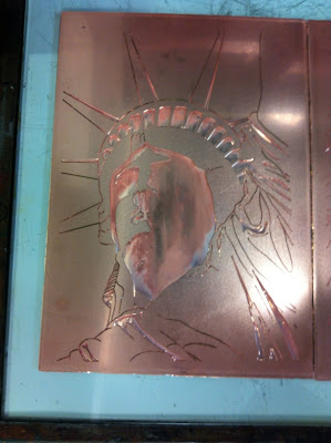
This is an image of the plates with the film layer on the stops the acid solution from etching into the copper. Where there is no blue, the copper will be eaten away to create an indent.


The plates after around 6 hours in the etching tank. Here it is evident where the copper has been eaten away and where it will emboss the material once put into the press.


The first cover for the San Francisco Bay Area guide, embossed with a detailed image of the golden gate bridge. Think this is looking really good, and the detail really comes out nicely in the emboss.

The example below is a fairly abstract representation of the holocaust memorial in Berlin in the process of being copper etched for the embossing plate.


This is an image of the plates with the film layer on the stops the acid solution from etching into the copper. Where there is no blue, the copper will be eaten away to create an indent.


The plates after around 6 hours in the etching tank. Here it is evident where the copper has been eaten away and where it will emboss the material once put into the press.


The first cover for the San Francisco Bay Area guide, embossed with a detailed image of the golden gate bridge. Think this is looking really good, and the detail really comes out nicely in the emboss.

Subscribe to:
Posts (Atom)