
Friday, 25 May 2012
Thursday, 24 May 2012
Product shots
Product shots of the tickets and exhibition catalogue showing the 4 colour ways used for catalogue covers and the 4 used for tickets. Really pleased with the quality of these outcomes despite printing them on a fairly cheap inkjet printer, and I like the combination of the colours, which I hadn't previously expected to work together quite as well. Each of these catalogues would be printed in the one spot ink that corresponds with the colour of the front cover. Here I have photographed blue, showing all the images as monochrome blue and the text in the same shade. This would make printing fairly cheap on a large scale and also gives a really interesting visual consistency from cover to cover.
Adshel


The end result... A blindingly realistic rendition of a poster for typografia in situe. Despite this, I think it does work well and certainly has a certain character that might make some one take a second look. I feel this also gives a really good idea of how the heirarchy may work, which bits may stand out more than others when the poster is full scale and in situe. All seems to be in order, although the text at the top may be a tiny bit small, I feel the most important information such as the date, venue and name come across very clearly.
Web Mock ups


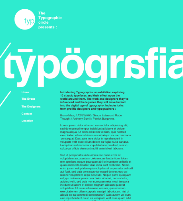
Typeface flyers
Here is a number of flyers that I created for each of the typefaces featured in the exhibition. For each typeface there is at the very minimum two flyers, one that is simply the name of the exhibition in that font and the other that gives a brief historical description of the typeface and how it came into being. This format could equally be applied in A2 to create typeface prints, that could be bought at the exhibition or given to people attending talks. Again I think the print method and use of different than standard print techniques may make this a little more desirable.
Here is simply experiments with exactly the same flyers as above, using scanned stock as background to get a more textured and hopefully realistic appearance. This will help to gauge which will be most effective when printed and also give and impression as to whether or not the stock I have chosen will work.
Exhibition Catalogue.
Issuu document of the spreads for my publication. These particular examples are blue to match the cover that I put them with however I would make each colour inside correspond with the colour of the cover. Pleased with this layout and how it turned out when printed.
Below are examples of some of the cover designs I was working with.


Talk fliers


Some examples of designs for prints to give out at the typografia talks based on the same principle that it would be a nice piece to have, reminding people that they've been to see a well known designer or typographer talk about what they do. I've displayed them all here in black as I think they could be in any colour, so black is just a neutral colour to display them.
Here are some examples of the same design applied onto scanned stock samples to give the texture and colour of how it may actually look. Again these will all be printed single spot colour onto coloured stock. This could be done either by digital white printing or by screen printing...each having a similar effect.
Screen prints
Here are the results of the screen printing session. Althought about 75% of the prints I made were pretty bad, there are some really nice ones in there, however similarly to last time there seems to have been a few issues with the screen or the exposure as certain areas ever got a clean coating.
The first images in these issue documents are just test pieces on newsprint and prints I was pulling as quickly as possible in order to loosen up the in on the screen. However towards the end is the better prints that appear to have turned out much better than I expected them to.
The first images in these issue documents are just test pieces on newsprint and prints I was pulling as quickly as possible in order to loosen up the in on the screen. However towards the end is the better prints that appear to have turned out much better than I expected them to.
Screen printing
Photographs from a session of screen printing.
I was skeptical to go and screen print as the last time I decided to, it didn't go well at all, and for the first few hours this time I seemed to be getting very similar results. However once I had got into the swing of it and also sought guidance from some workshop staff I started getting slightly better results.
I was skeptical to go and screen print as the last time I decided to, it didn't go well at all, and for the first few hours this time I seemed to be getting very similar results. However once I had got into the swing of it and also sought guidance from some workshop staff I started getting slightly better results.
Tuesday, 22 May 2012
Screen print negatives


Due to my being unprepared to screen print until very late on into this brief, I was not able to get into digital print to produce a poster the full size I wanted. This meant splitting it into two documents and printing them seperately to make a whole A2 from 2 A3s. Although it is possible to use the print settings in Indesign to print 2 halves of one larger image, I felt it was easier to get a much more accurate registration this way. However the problem would be exposing the screen using the two halves without getting a visible line down the middle of them that would affect the final print.
Monday, 21 May 2012
Few poster alterations.


Above are two possible developments of the A2/SW/HK poster making use of the typographic circle layout and logo from other posters. I think this does work better and gives an element of standardisation to all the posters, giving a much more recogisable aesthetic throughout.
Web mock ups


Here are a few initial ideas for the website for the exhibition. this look at very simple homepage layouts, making use of a fairly standard navigation bar and header. However these two elements of the design I would like to follow the scroll so they are always in exactly the same place on the screen, regardless of what else is on the page. The small image in the bottom right of these three shows how this might work with the other elements on the page. The larger top image shows how the navigation bar would indicate which page the user is on, with a diagonal line matching that of the logotype.
I also worked in this mock up with the idea that the images would be partly visible at the edge of the page. Clicking on these would then mean that the body text dropped behind the navigation bar and the images moved with them to take the place the copy was originally in. This reveals the whole image aswell as a description about the piece it is showing. For the sake of this mock up I have used flyers that I designed for the exhibition promotion, however these would most likely be examples of works in the exhibition. I quite like this idea as it gives a visual element to the homepage that wouldn't be there without, and gives an interesting element of movement to the page, aswell as the up/down scroll.

This image just shows an alteration of the colour for the title, as it makes the body copy readable as the user scrolls over the page. Ideally the image that I've placed in would match the colour of the title because in Indesign it is. However it most probably would be a different image anyway.


Unsure as to whether I prefer this colour background to the white, however I think the white background gives a much better platform for photographs and other imagery as it means that the background of the images aren't too much of a contrast from the background. However the green relates more to the printed matter so it could give a much better visual link to those using the site.


Above, a look at further experiments with colour and using the opposite end of the scale in terms of neutrality, white text on black. Although typographically this is considered quite a bad thing to do, I think it links back to the printed matter better than the flat white background, despite the fairly recognisable logotype. I've also added the typographic circles logo at the top, as these would be the basis of the event itself, and seeing a recognisable logo/name would be much more likely to get people to investigate further.
I think the last image, white on 96% black background is my favourite, in terms of layout, however again the placement of images becomes a bit of an issue as these would most likely be very brightly coloured and have much closer to white backgrounds. So it's still a toss up between this and the other examples.
Subscribe to:
Comments (Atom)