

Showing posts with label opposites. Show all posts
Showing posts with label opposites. Show all posts
Tuesday, 29 March 2011
Tuesday, 8 March 2011


Further typographic development.
Similarly to how I had been working on previous thumbnails, I thought about taking popular or well known oxymorons and juxtaposing them typographically to show the difference, or indeed similarities of the two.


 Here are three possible outcomes for a typographic poster for my oxymoron concept. The top two take the idea that the digital font is exact or accurate, and my hand rendered version is simply an estimate. A very simple idea however I think this was one of the most effective I came up with overall. The bottom of the three ideas uses a shade of grey so close to the white of the stock that it is almost impossible to see. This is how I produced it on screen as there are no other ways to get this effect. However if I were to print it, I would make use of a spot varnish or a glossy ink that would mean the type beneath is only visible at certain angles. Again, a very simple idea, but I really like these. The bottom one also has a strange effect on your eyes if you look at it for a long time trying to make out the type underneath, the black type from above, seems to flash over the bottom type, giving a slight optical illusion.


Oxymoron idea development.

 |
| Slightly altered the shade of the text below. |


 | ||||
| This shows my hand rendered type scanned, which I then edited | digitally. |


Further development of concept.
After first looking into the very abstract link between opposites and a game on old nokia phones, I wanted to look into other possible routes that my project could take. From this I went back to looking at the subject of opposites in my original notes and thought about its definition, one stood out as a good possibility for visual experimentation.
- being directly across from each other; facing; "And I on the opposite shore will be, ready to ride and spread the alarm"- Longfellow; "we lived on opposite sides of the street"; "at opposite poles"
- of leaves etc; growing in pairs on either side of a stem; "opposite leaves"
- antonym: a word that expresses a meaning opposed to the meaning of another word, in which case the two words are antonyms of each other; "to him the antonym of `gay' was `depressed'"
- moving or facing away from each other; "looking in opposite directions"; "they went in opposite directions"
- reverse: a relation of direct opposition; "we thought Sue was older than Bill but just the reverse was true"
- opposition: a contestant that you are matched against
- altogether different in nature or quality or significance; "the medicine's effect was opposite to that intended"; "it is said that opposite characters make a union happiest"- Charles Reade
- face-to-face: directly facing each other; "the two photographs lay face-to-face on the table"; "lived all their lives in houses face-to-face across the street"; "they sat opposite at the table"
- inverse: something inverted in sequence or character or effect; "when the direct approach failed he tried the inverse"
- diametric: characterized by opposite extremes; completely opposed; "in diametric contradiction to his claims"; "diametrical (or opposite) points of view"; "opposite meanings"; "extreme and indefensible polar positions"
Layout based.


More type possibilities.


Snake type posters.


Here are a few possible layouts for my poster making use of the snake style type that I had developed earlier. I like these, however I prefer the two blue ones, using colours closer tothose that you would actually get on a old phone screen.
Developments in concept.
I then moved on slightly from simple typographic opposites and tried to look more conceptually at the idea of opposites and how this could be used typographically. From playing around with my phone I remembered the old snake game on nokia phones and how the snake used to go off one side of the screen and come back on the opposite side. I thought this was a recognisable game for almost any audience, however the link between it and opposites may not be particularly strong. Despite this I carried it as an idea because of possibilities with interesting type.
 This image shows how I began working with the idea of snake. Taking on board my experience of snake, on a pale blue screen with a darker blue snake. I then went about attempting to create the type without breaking the line from this point.
 Here are my results from trying to create a snake like aesthetic. Although the idea is there I don't think I've exactly captured the essence of the movement of the snake. and it almost becomes quite confusing to read as it is not exactly clear which side the snake is coming from or going to.
 This shows a look at another route to create the type from the snake game. This one I dropped because I thought it became illegible too quickly and I also didn't know where to go from the point at which I took the screenshot as I could go back on myself.
 After a few doodles trying to establish the best route I chose to go with the bottom one as it was the one that was most legible and used only one line to create.


This series of screens shows the development of the snake type...there are a few minor problems however I think it works quite nicely and is still a viable idea for my final typographic submissions.
Opposites... Black&White

Thursday, 3 March 2011
Opposites...colour
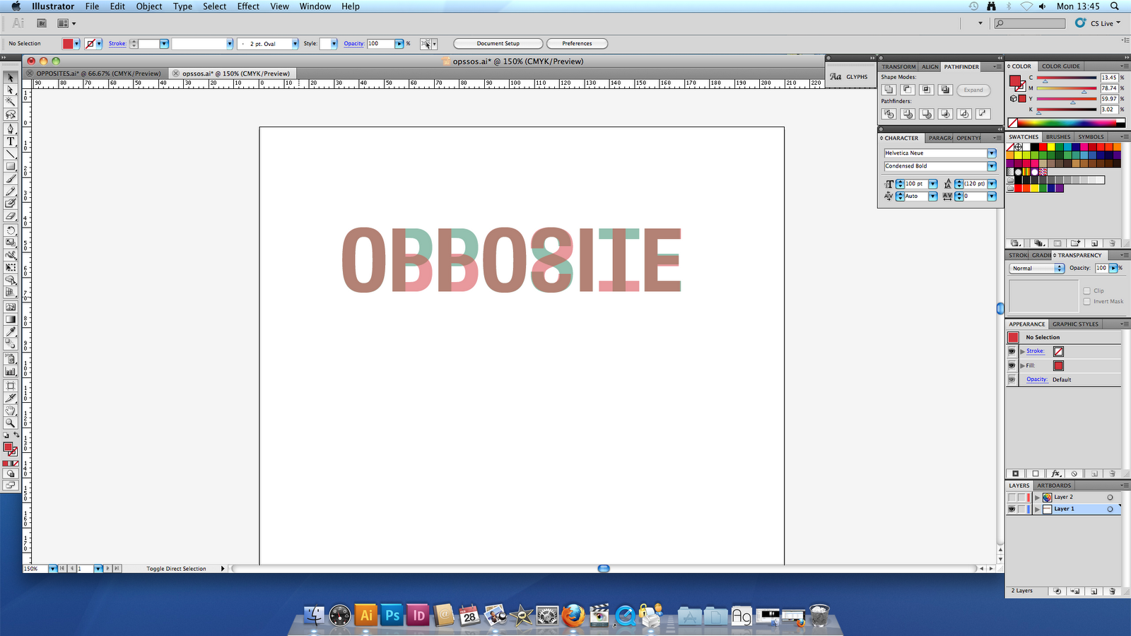


I then started looking at using differing opacities to portray colour opposites and trying to create a layout which simply outlines my concept. This also had to be bold and striking and stand alone as a piece of typography. I have also looked at adding a small caption just to break the image up slightly and give the piece a name however I don't think this is strictly necessary.
Tuesday, 1 March 2011
Opposites... Initial poster ideas.


Above I looked at combining the two sides which I had then created to make a rather more abstract typographic variation. This looks Ok, however opposite becomes totally illegible because of the nature of how I have used the letters.
Subscribe to:
Posts (Atom)