

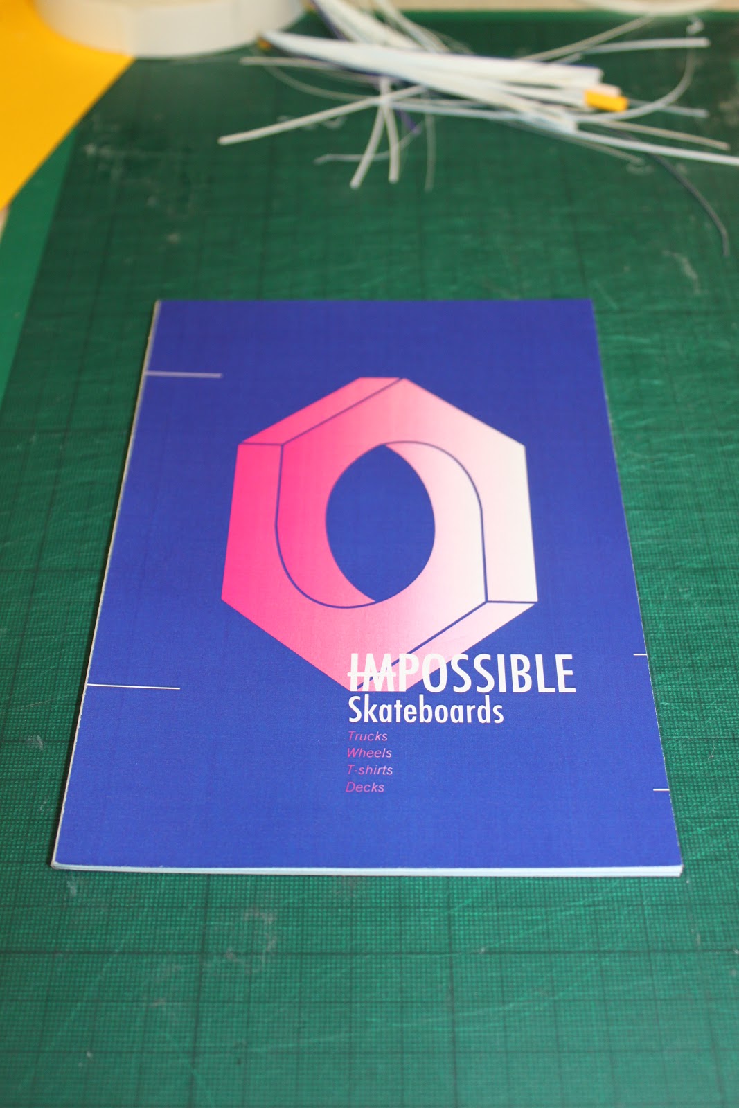
Mango stock with deep blue flood background (goes black on the yellow) a magenta gradient logo and text. Yellow bind held over the covers. Like this bind however I think it could do with some refinement.

The detail.

The back.

The bind.

The front.

Cyan flood background on the same stock (goes green...) , again with magenta gradient on logo, however a much simpler typographic layout, giving only the vital information.

the bind.

The back.

Black print onto standard copier paper, looking at the effect stock weight has on the books feel and strength. back to my original type and logo arrangement.

The bind. (cyan stock scored to give a crisp as possible fold, covers placed on top of bind)

The back.

Orange/bronze foil blocked copier paper done on the laminator in the library. Really just looking at the finish provided by the foil block but thought I'd kill two birds with one stone and test a similar binding technique with a different cover.

The foil.

the logo.

the bind.

the back.

My very first binding mock-up that I presented at the final crit. Done with a standard booklet bind, folding all the sheets and placing them one on top of the other, the cover then wraps around this. Found out (from the crit especially) that the flood background isn't good with the fold, because aswell as cracking from the folding itself, it got worse as people handled it more and more. Hence the mock-ups for different binding technique, all of which negate the need for a fold...

the edge - the staple.

The back. (ideally the orange overprint would be a gloss orange foil)
Another mock-up. This one the same as the very first in this post however it is printed onto white stock. Shows more how the stock affect the printing. I really like this navy blue against the yellow magenta gradient however, so I think I'll have to print onto a white stock.

The back.

The bind. crisp.
No comments:
Post a Comment