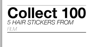
Looking at the positioning of lines in the same way as the type layouts on the poster. I think maybe a vertical line is more appropriate for the type layout when the packaging comes in this format.
Looking at different types of the face I've been using, using italics, small caps etc.
Trying to give the information the right hierarchy of information using different weights and point size for the more important information and that which will catch the eye when in a shop.
Looking here at the positioning of the price and trying to find a place for it to fit nicely into the layout but still be easily noticeable, so not having to search for the price.
Moving the price in this instance to the left, having it aligned with the type above I think works quite nicely.
Here are a few screens showing the full pack as it would be, folding it down the middle around the plastic pack would fasten it shut.
A collection of screen grabs showing the development of my packaging which will be in the very simple form of a piece of card, folded in half and stapled round a bag with the stickers in... This means that the product is visible inside the packaging and allows the consumer to see what they are getting. Here I have looked at type variations and also variations in the type of pack, for example different ways of grouping the packs.
e.g. 25 random stickers from film
10 stickers from music
TV pack


No comments:
Post a Comment