Monday, 14 February 2011
Hairy sticker book further development.
Here are a few investigations into the face I wanted to use on the front cover of the book, looking into weight, point size, italics font and so on. I think again to keep visual consistency it would be best to use a bold Helvetica face along with a light. This time I have moved away from the ultra-light face on the front to keep the type legible when printed onto the red background.
A few more alterations looking mainly at the point size and how it sits on the front cover. Also investigating the option of upper and lower case. I think lowercase is the way forward for the main title, same as on the A1 poster, with the accompanying text in uppercase helvetica light.
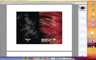
Above is an image of the preview created by saving the document as a paginated post script document. Meaning that all the pages lie in the correct order when printed double sided and put together as a book. A very useful feature which was not previously available, and would have had to be worked out.
Labels:
OUGD102 - collection 100
Subscribe to:
Post Comments (Atom)


No comments:
Post a Comment