
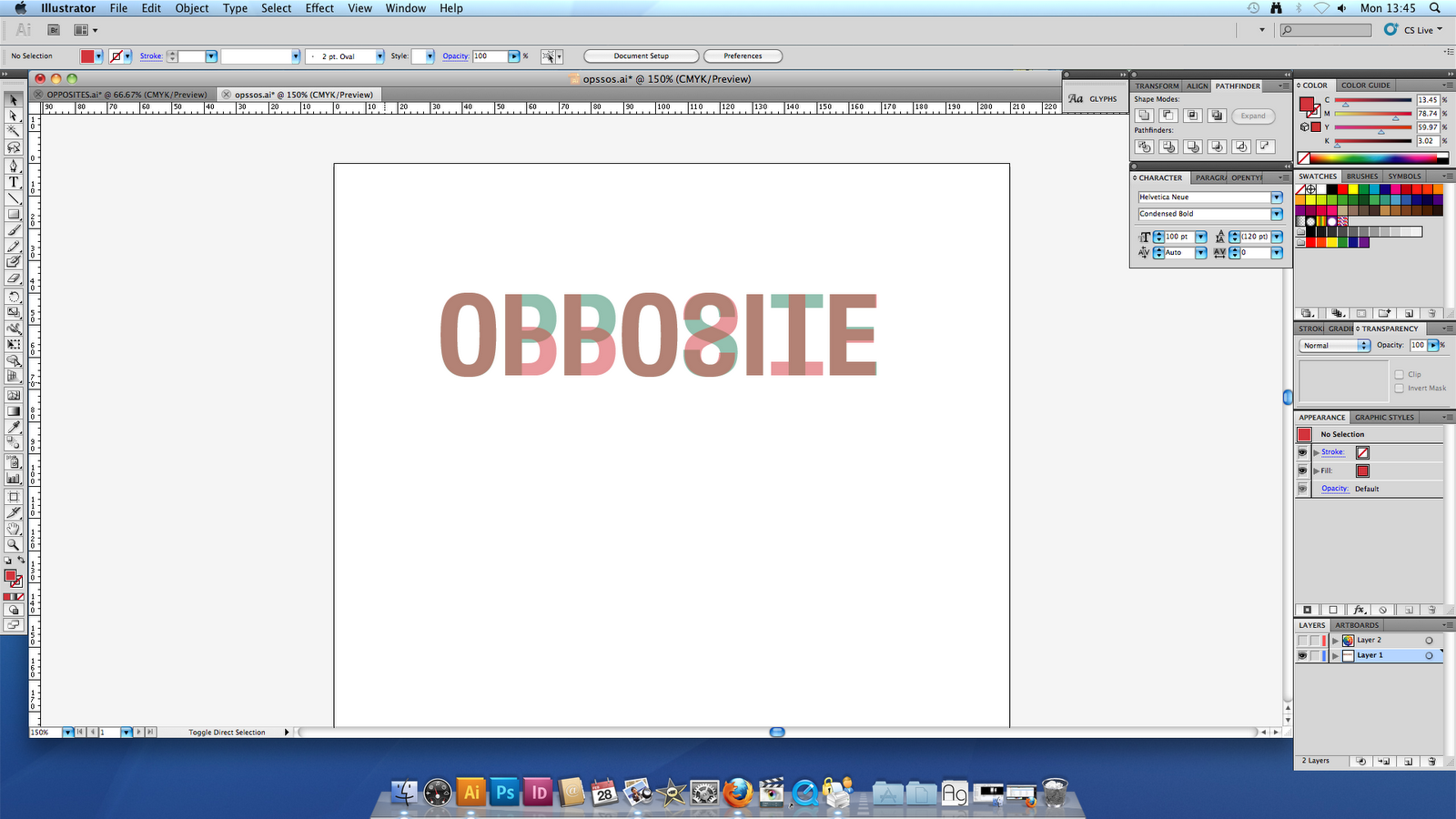


I then started looking at using differing opacities to portray colour opposites and trying to create a layout which simply outlines my concept. This also had to be bold and striking and stand alone as a piece of typography. I have also looked at adding a small caption just to break the image up slightly and give the piece a name however I don't think this is strictly necessary.
No comments:
Post a Comment