99% of the time use a new 'document' book on indesign refers to something with hundreds of pages, isn't really necessary on the scale we're working.
Indesign books are very complex
Selecting size.
when opening a new document, choose the finished, trimmed size of whatever you are working on and printing. A4, A0 etc.
Bleed
- Compensates for cutting errors after printing.
- having bleed means there should be no white edges if it is slightly mis-aligned
- 3mm bleed is usually sufficient.
All other factors when opening a document really depend on what you're creating.
(colums, gutters etc.)
Applying colour.
Shift - x
will switch between fill and outline in the picker.
Swatch palette is very similar to illustrator.
These images look at the application of colours using colour books to both type and created artwork.
Moving artwork from photoshop
- CMYK or grayscale.
- 300dpi
- actual size (don't resize in indesign)
- Format - TIFF > PSD > psd will maintain transparencies.
Moving artwork from illustrator
- CMYK
- Format - Ai > transparency is maintained
- Doesn't matter what size as vector artwork can be resized.
Placing images
File > place
From PSD - swatched will be added to the documents palette. Can create border first to put image in or just place the image.
File > place > show import options
This allows detailed changing of file options like layers etc.
Links palette
- when placing an image into indesign, it simply establishes a link with the actual file.
- it's important to package everything and keep all your related files in one folder.
- packaging also means that if the original image is edited, it will automatically update.
An image of the links palette from my print top 10 booklet. As I have not yet packaged the document there are a few missing links, but I know where they are...obviously.
Alt + double clicking any image in the document will open it in the program it was created in.
Toning images
Has to be done from a grayscale image placed in indesign.
select the grayscale image > the image itself, not the frame
- then select a swatch from fills.
The image above was created using this technique of applying a spot colour to a grayscale image, it works much like toning in photoshop however it isn't quite as editable and can only be done with one colour.
Seperations window
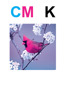
this allows you to look at the colour seperations in the image
the full colour image with all the seperations visible.
Cyan removed.
cyan and magenta removed.
just black and the spot colour.
Yellow removed. I quite like this effect, especially on this image.
It is also possible to delete unused swatches using the seperations palette
Knockout & overprint.
Using seperations allows you to see colour 'knockouts'
this is where the colour is not overprinted as the colour printing on top is too light.
This is what the knockout looked like for the colour selection above. showing where the green is removed to allow the orange to print.
This is the seperations layers showing where the is too much ink, with the overprint preview, the red area refers to that where there'll be too much ink.
Here are the colours without knockout, so they are overprinting. The problem may arise in this situation that there is too much ink on the paper.
This shows the colours cyan, yellow and magenta applied normally, so each will knockout the other in order for them all to print normally.
My finished indesign document with all the techniques from the workshop in one.


No comments:
Post a Comment