


Above is development for my first flat net packaging and I have looked mainly at the implementation of my logo onto the net and the colours used. From stock experimentation with printed logos I found that the logo looked really strong in red on yellow stock. SO other than the black experiment in the bottom right, it is assumed that all of these would be printed onto a bright (mango) yellow-orange stock. personally, I like the simpler designs, applying the logo centrally onto the envelope with the flood red backdrop.


Here are more examples of digital packaging development that look at the second envelope net. Another net which creates a square format when made up and placed flat, however it is possible to work with an part of the net. For this one I was slightly looser with stock consideration and was designing regardless of stock, so there are examples that would be best to stay white and also those that would look better on a coloured stock. The majority of the designs have white in them however, so it would eed to be a stock that gave a good contrast the colours used. Here the designs I prefer, were those I looked at applying my logo differently. Such as the examples in which the nut is placed where the two sides of the closing section will meet to create the logo ( I am aware in these that the section of the logo on the tab is placed wrongly, however I moved it when printing the designs).
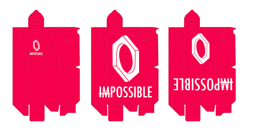

Some development for the larger net, that creates a standing package suitable for bottles and such like. I looked here mainly at how the type of the logo interacted with the net itself. Some here, I also placed it upside down as I quite liked the idea of something a little harder to read, to give it a bit of intrigue, and something a little different.


Finally a series of developments of the third flat, envelope like net. Here I looked at a range of colour schemes and ways to implement the logo. As this was the first one I worked on I was able to apply knowledge from the creation of this net onto the development of the others. I looked a lot at repeatable pattern on this net, however I think these repeatable patterns are very busy. Knocking these designs back in opacity to around 40% and placing them inside the envelope could create a really interesting effect.
No comments:
Post a Comment