Looking at adding type, using different impossible shapes and changing
the background shape to incorporate an i... impossible. I don't like
adding type to the logo itself as I think it clutters it, and it's
something I'm not sure it actually needs. Adding the 'i' into the
background shape I think was a nice idea, but in practice I'm not sure
about the shape that it creates and the awkwardness of the lines against
the shape inside, I'd prefer a solid backdrop.
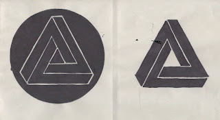
Simple developments of the above, looking at slightly different ways to fill the the shape and it's aesthetic on the page as a logo.
Here I looked at different fills and placing the shape itself as a positive instead of reversing it out of a background shape. I also looked at another possible shape (top right) although I'm not sure this would translate into an effective logo, and also at combining a previous development with type, this is one that's just far too busy.
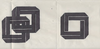
Looking at the use of a square with similar characteristics to the impossible triangle, and also at linking them to see the effect it has on them as a logo. It looks Ok even though I got these linked squares slightly wrong when filling them in with black and covered some lines. I think this may be a bit much though and again I'm not sure of it's plausibility or relevance as a logo.
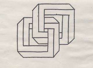
A combination of two impossible triangle that I joined and then filled with lines. Although this complicates the logo quite considerably, I quite like the aesthetic it creates, and using different orientations of the symbol also gives a very different aesthetic and plausible shape
to work with as a logo. Another look at the square impossible shape
and the manor in which it is filled.
A combination of two of the squares which works Ok, but I think it is better when filled in black with white strokes as it just gives the symbol more weight and impact. Despite this I think the examples still showing the most promise are the original triangle that was chosen for me to develop.


No comments:
Post a Comment