The first few attempts at designing a specimen poster, revolved around showcasing the whole font and using an overlay to make the poster more aesthetically pleasing. At then end of the day, before promoting the font this has to be attractive enough for people to want to buy it, then they can think about the font.
I then moved away from making the face fill the entire page and went for a different configuration of elements on the page. I also made the form and writing name much more obvious as I thought it would be useful to promote ourselves using our own font.
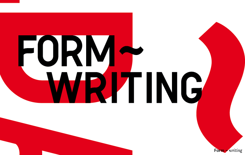
However I also worked on creating posters using an example of a single character, with the rest of the font much smaller at the bottom but still present in the layout. Thought this was quite nice as I really like the Q, and I think it is a good example of some of the subtle features that make Matilda when it is blown up large, but also gives the opportunity to show how it would appear when placed much smaller.
I then went for a similar layout but altering the colour, because it was based on road signage I thought it would be relevant to try and get colour in from road signs to provide a nice link between its origins and where it is now. So my thought process here was to use yellow, with a road signs blue overlay, producing the green from road signs. Felt it would be more interesting to do it this way rather than just using the two flat colour on their own.
This is probably my favourite of those I've produced so far. I think it shows really nicely the differences between the characters, even down to the few millimetres difference in weight of the tail of the Q and the leg of the R that all help to make the fonts weight appear consistent visually. This is also good in terms of screen printing as it uses two colour as opposed to the three of some of the designs, however registration of the information at the bottom may be very difficult.


I then went onto illustrator and worked with the blend tool as I thought it would be really interesting to move on from the simple overlays and work with actually blending the characters to see what they made. The example above, is made from a yellow Q, green R and blue Q. Blended to make a strange hybrid lump of the three. Although not necessarily entirely relevant I think this looks really cool, but would be an incredibly difficult effect to achieve screen printed. Which is ultimately what we'll be doing with the specimen posters.


No comments:
Post a Comment