
However when it came to the logisitics of screen printing all 6 A2 prints, each having at least 2 colours, we felt it may be better to have less variation but more volume, and choose one from each of us to have 3 overall. We felt it was quite nice that we all had a different take on the specimen posters, but all will be consistent in their colour and the information on the poster.
Below are the screen print positives printed at A2 scale.
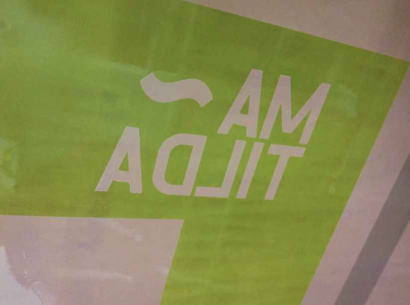
These are the postives for the prints I designed, using my two favourite characters which are over layed to show the subtle differences and to mix the yellow and blue we've chosen to give a green like that of the british road signs.


Positives for the poster Joe designed.
Focused more on the curvature and subtleties of the letterforms using enlarged letterforms to create more abstract layouts.


Positives for Yaf's prints.
which breakdown the font into lines almost just giving a taste of the font to give a bit of intrigue. The information provides anyone that sees it with a method of contacting us about the font.


The screens in development.


No comments:
Post a Comment