Blank mock-up of Typografie exhibition programme based on a square format. I went for this because of square formats being very popular with Swiss Graphic Designers, and it is also something I've never really worked with before. I quite like the brown cover, but as I've not printed on it yet I'm not sure how this will come out. Also it is very difficult to get the width of the spine when doing the cover as a full wrap around like this, I may have to look at another type of cover
Printed
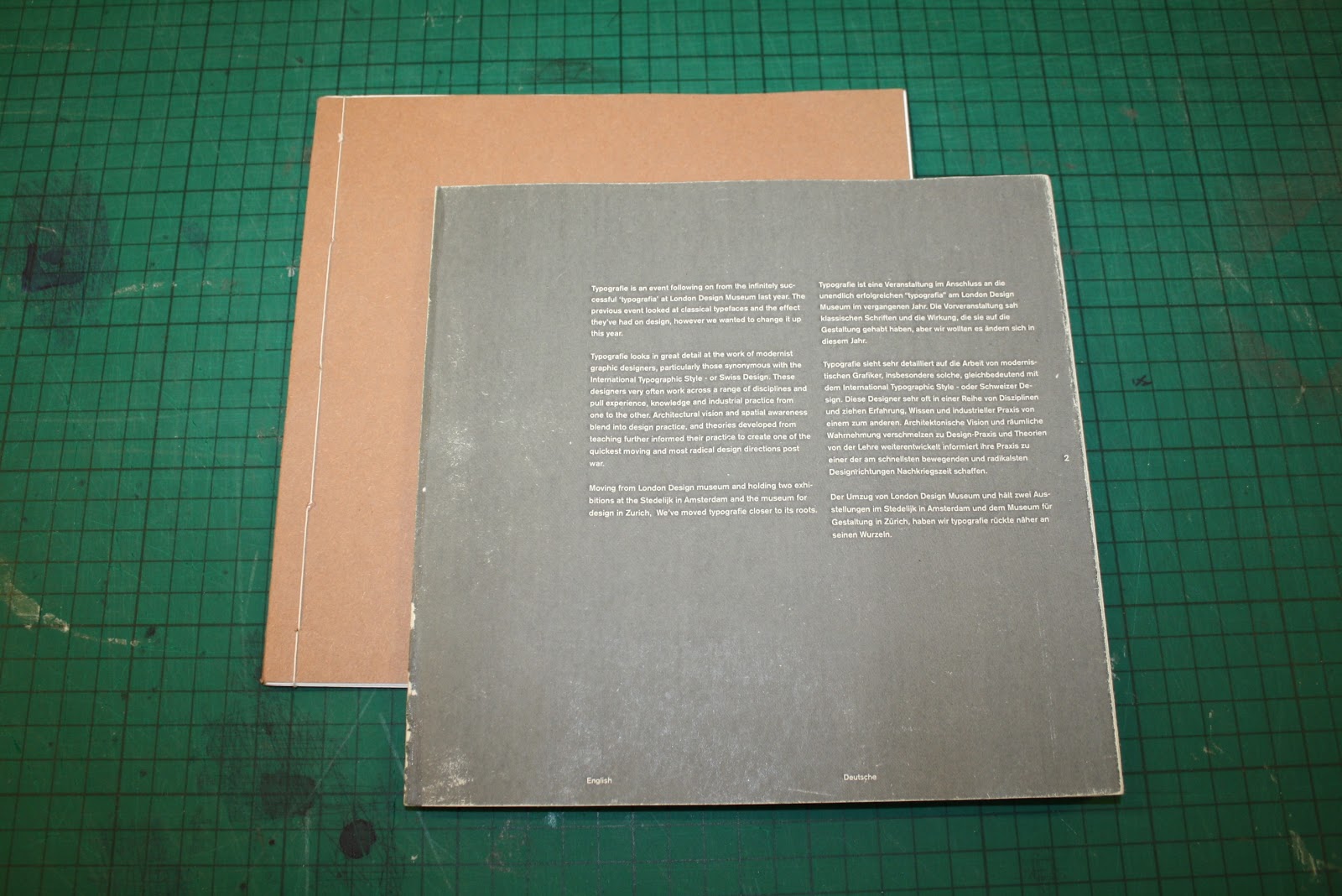
Here are image of a printed test, using the layouts developed based on a 2 column grid, because of the two languages in the programme. I chose to set it in two languages because of Swiss designs want for a single communication that is not affected by language, having the two means that it is more accessible by those attending the exhibition, especially with them being in German speaking countries.
Not very clear from these images but this is also a french fold book, the inside of each of the pages will be printed with flood red to mirror the red of the identity and of the links with Swiss design. Any pages that are block grey, like the one above will also be flat red on the colour printed programme.


No comments:
Post a Comment