


Here are a few initial ideas for the website for the exhibition. this look at very simple homepage layouts, making use of a fairly standard navigation bar and header. However these two elements of the design I would like to follow the scroll so they are always in exactly the same place on the screen, regardless of what else is on the page. The small image in the bottom right of these three shows how this might work with the other elements on the page. The larger top image shows how the navigation bar would indicate which page the user is on, with a diagonal line matching that of the logotype.
I also worked in this mock up with the idea that the images would be partly visible at the edge of the page. Clicking on these would then mean that the body text dropped behind the navigation bar and the images moved with them to take the place the copy was originally in. This reveals the whole image aswell as a description about the piece it is showing. For the sake of this mock up I have used flyers that I designed for the exhibition promotion, however these would most likely be examples of works in the exhibition. I quite like this idea as it gives a visual element to the homepage that wouldn't be there without, and gives an interesting element of movement to the page, aswell as the up/down scroll.

This image just shows an alteration of the colour for the title, as it makes the body copy readable as the user scrolls over the page. Ideally the image that I've placed in would match the colour of the title because in Indesign it is. However it most probably would be a different image anyway.


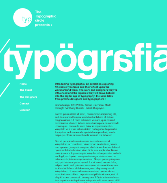
Unsure as to whether I prefer this colour background to the white, however I think the white background gives a much better platform for photographs and other imagery as it means that the background of the images aren't too much of a contrast from the background. However the green relates more to the printed matter so it could give a much better visual link to those using the site.


Above, a look at further experiments with colour and using the opposite end of the scale in terms of neutrality, white text on black. Although typographically this is considered quite a bad thing to do, I think it links back to the printed matter better than the flat white background, despite the fairly recognisable logotype. I've also added the typographic circles logo at the top, as these would be the basis of the event itself, and seeing a recognisable logo/name would be much more likely to get people to investigate further.
I think the last image, white on 96% black background is my favourite, in terms of layout, however again the placement of images becomes a bit of an issue as these would most likely be very brightly coloured and have much closer to white backgrounds. So it's still a toss up between this and the other examples.
No comments:
Post a Comment